Guides: UQ Drupal Fundamentals course
Topic: Components
Hero banner guide
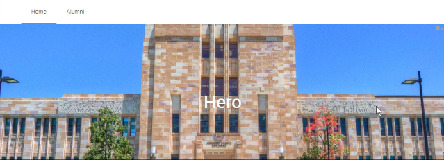
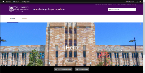
The Hero Banner is a page title component for Panel pages. It outputs a <h1> element for the page title overlaying an image, and can optionally have 1-3 action buttons. Only one Hero Banner should be used per page and it should ideally be the first component on the page.
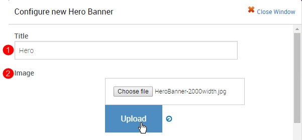
Step 1
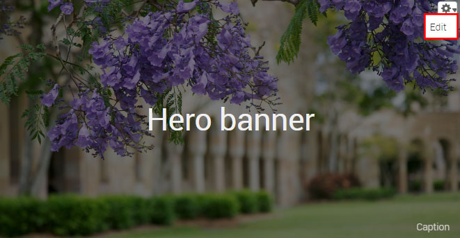
Hover the mouse pointer over the right-hand corner of the hero banner pane to display the Edit cog ( ). Click the icon to display the menu and click Edit to open.
Step 2
The configuration form for the hero banner component displays.
- Title - the title of the home page can contain a message. Words on hero banners on other panel pages should be minimised to one single words where possible.
- Image - the minimum image dimensions should be 2560px X 560px.
- Caption - for the purposes of attributing the image as per the copyright of the image.
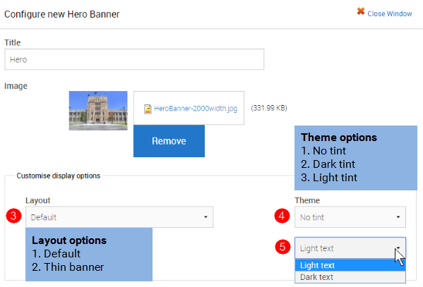
- Layout - select between the default and thin banner
- Theme (tint) - choose between none, dark or light tint to overlay the image.
- Text - depending on the selected tint, choose the text light or dark to ensure sufficient contrast between the text and image to improve legibility.
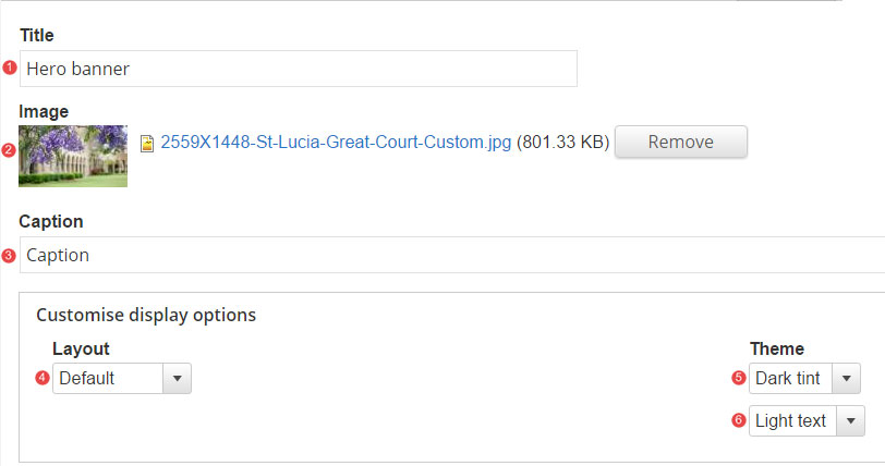
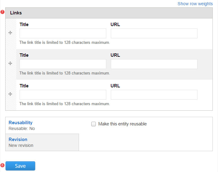
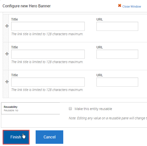
- Links - insert relative path links when linking to content on the site. If required, select between 1, 2 or 3 links.
- Save the changes.
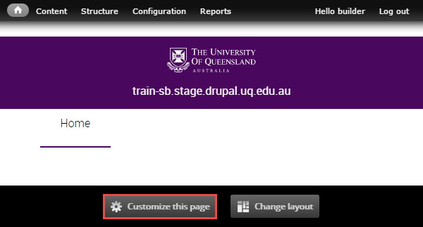
Step 1
Click Customize this page to start adding components to a panel page.
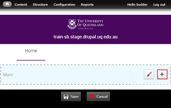
Step 2
The available regions where components can be added are displayed as blue shaded fields. Click the plus (+) button to open the list of available components grouped by category.
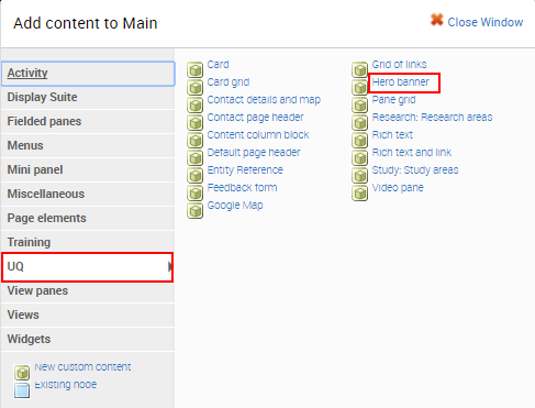
Step 3
The available components display. Click on the UQ category and then select the Hero Banner component to open the configuration form.
Step 4
The configuration form for the Hero Banner displays. Complete the fields before clicking Finish.
- Title - insert a title for the component
- Image - select an upload an image from your computer
- Layout - retain the default banner or select a thinner banner.
- Theme - retain the theme or add a dark or light tint.
- Text - retain light text or change to dark text
-
If the Hero banner has three links, insert the title and URL for the links and click Finish.
Tip: Use a relative reference when linking to content on your website.
Step 5
The system returns to the panel page In-Place Editor. Click Save to complete process of adding the component.
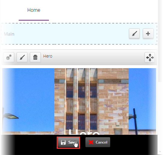
The completed component displays.
Hero images
Recommended image dimensions: 2560px wide by 560px high
Best practice
- Apply a dark tint to ensure the white text stands out with enough contrast. Dark tint does not need to be a part of the actual image. It is an option when creating the hero banner component.
- Recommended image size should be adhered to. This will remove the possibility of the image being stretched, which will result in a poor image appearance.
- If possible, choose an image which is free of other distractions, where the person/object or theme is the focal point.

Avoid these mistakes
Too much text
- Banners should contain a short message that is quick and easy to read. Users are more likely to read the text if your messages are short and succinct.

Busy imagery
- Avoid using banner images that are overly bright, which diminishes the ability of the copy to stand out sufficiently.
- Avoid using images which have very busy imagery, which may detract further from the banners messaging.

Too small images
- Images smaller than recommended dimensions will be stretched to fill the space, which will result in a poor image quality.
Image source and attribution
Conditions and attribution
It is your responsibility to understand and comply with any conditions of use associated with images on your website. Ideally, attribution appears as a caption under an image or if this is not practical, at the end of the page.
It is recommended that you avoid:
- original works which do not permit modification as the image in UQ Drupal may display differently on different devices or in a featured view
- photos of people where there is not permission to use their image.
UQ image sources
- UQ Images (uq login required)
- local school or faculty storage drives
- Google search 'UQ' plus your keywords or search UQ news to see if your School or Faculty already has images on your topic. If in doubt check with the owning organisational unit as to whether you can use it.
- eSpace advanced search using display type 'image'.
Externally sourced images
Stock images should be avoided as they detract from the authenticity of your messages. However, you can purchase stock images from sites such as iStock or Shutterstock. It's possible that there is a stock image account in use in your local marketing and communications unit.
Wikimedia commons
Wikimedia commons is the largest single repository of media which can be reused without charge on the web with over 27 million files. Wikimedia offers images of art, antiquities, historical events, places, buildings and nature. The image must be pubilc domain or creative commons licensed for you to use it. It is recommended that you cite the image using the Wikimedia format which includes a name or short title, the name of the photographer or artist if available, via Wikimedia Commons, and the legal status (expressed as public domain or CC2.0, 3.0 etc).
Examples:
The Young Student by Ozias Leduc, via Wikimedia Commons, Public Domain.
High magnification micrograph of a liver with cirrhosis. Trichrome stain. Nephron via Wikimedia Commons CC 3.0
Topic: Basic page
Review the guides relating to creating and editing basic pages.
Guides for Task: format content
Basic pages are the simplest and most common type of page. The majority of general content pages on a site will be either Basic page or Structured pages.
Step 1
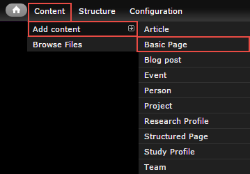
In the administration menu, go to Content > Add content > Basic page.
Step 2
The edit screen displays.
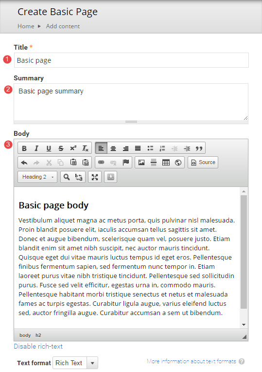
- Title - Page title
- Summary - Optional. Displays in teaser and card views where the page is referenced in a list. Doesn't appear on the page.
- Body - Content of the page
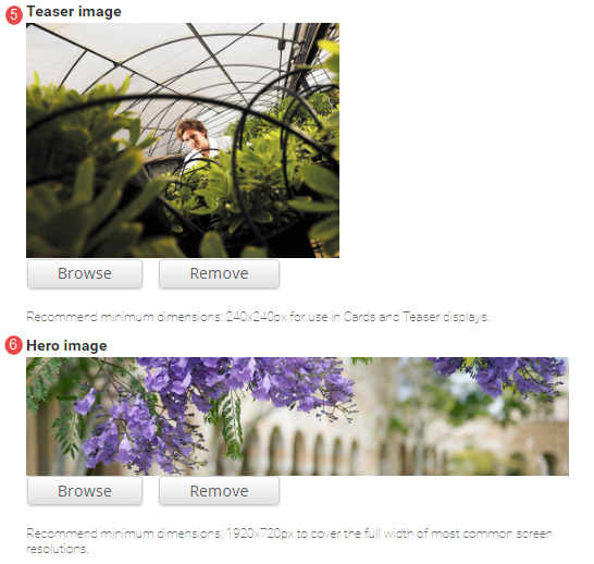
- Teaser image - Optional. Displays in card and teaser views. Advice on images.
- Hero image - Optional. Replaces the default page header with a hero banner header.

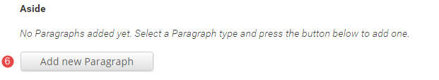
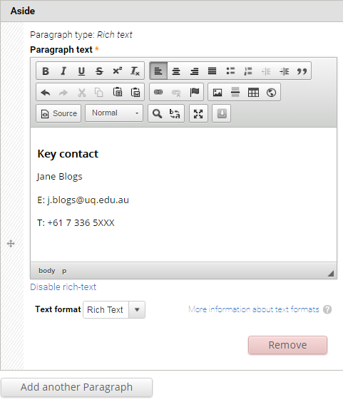
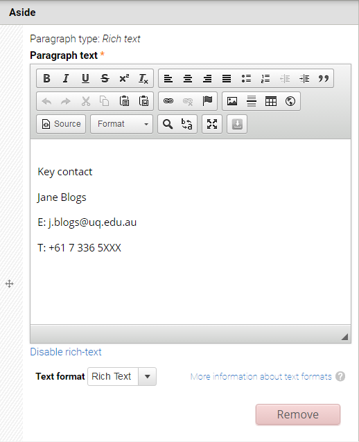
- Aside - Optional. Used for content that is tangentially related to the Body content, such reminders or contact details.
Click Add new paragraph to create an Aside.
Note - Headings used in the aside, should start at heading level 3.
The Aside field displays.
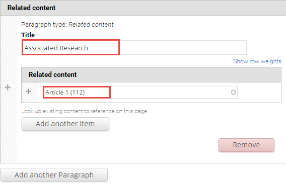
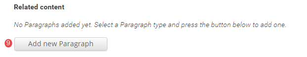
- Related content - Optional. Allows other pages on the site to be referenced in a short list. The relationship is manually created, not inferred from any data such as tags.
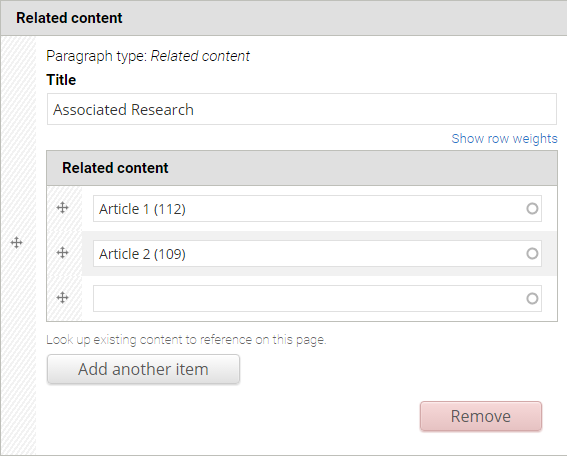
Click Add new paragraph to create a related content group.

The Related Content fields display.
Title - Optional. Heading to label the related pages. e.g. "Associated research", or "See also"
Related content - Reference to other pages on the site. Type the first few letters of a page title to look-up the desired page. Multiple related pages can be added.
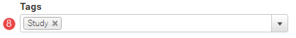
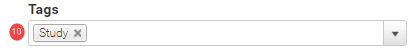
- Tags - Click the dropdown arrow to select a tag from the list of vocabularies and their terms to categorise the content.
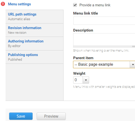
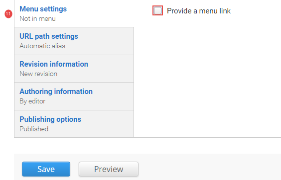
- Menu Settings - Tick provide a menu link to display the menu settings options. Adding a page to the menu ensures it will appear in the site map.
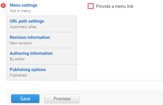
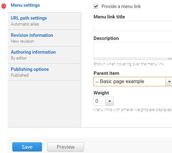
Enter the menu settings fields.
Menu link title - The menu link title is automatically populated from the basic page title. The menu link title can be edited.
Description - Content entered in the description field will be displayed when hovering the cursor over the menu link.
Parent item - Selection of a parent item ensures improved website navigation by displaying a breadcrumb trail at the top of the page.
Weight - Select a weight to determine the order of the menu link in the Parent Item. Menu links with smaller weights are displayed before links with larger weights. Tip: easier to drag the links into position to change the order. Review
re-order menu links.
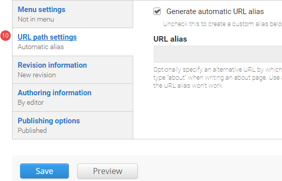
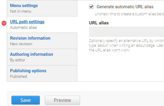
- URL path settings - a friendly URL is generated automatically if the tick box remains ticked.
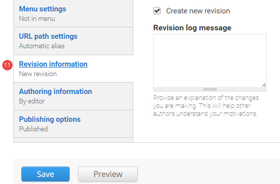
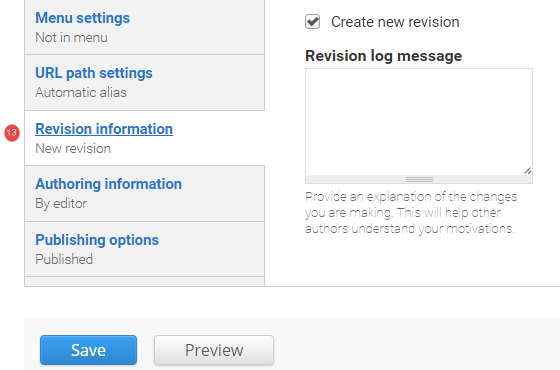
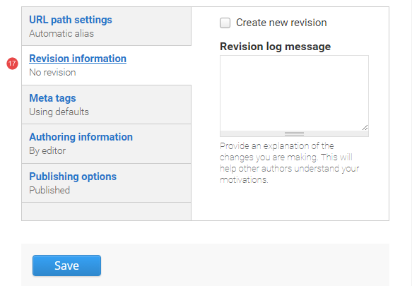
- Revision information - if create new revision remains ticked, a new version of the basic page is saved each time after it is published. The versions are accessible from the revisions tab.
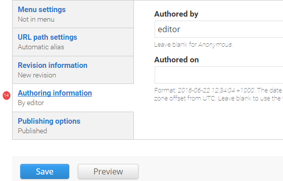
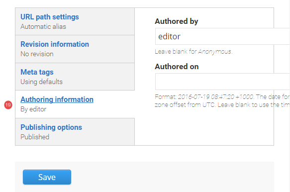
- Authoring information - The information of the author is recorded. After the basic page is saved, the "Authored on" field is updated.
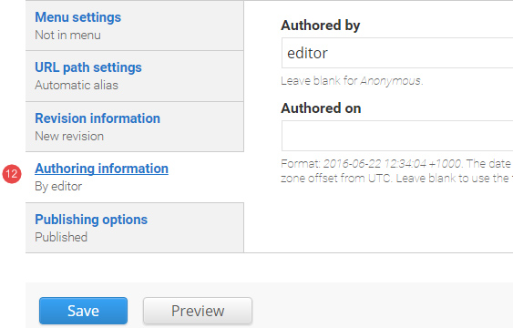
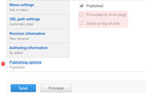
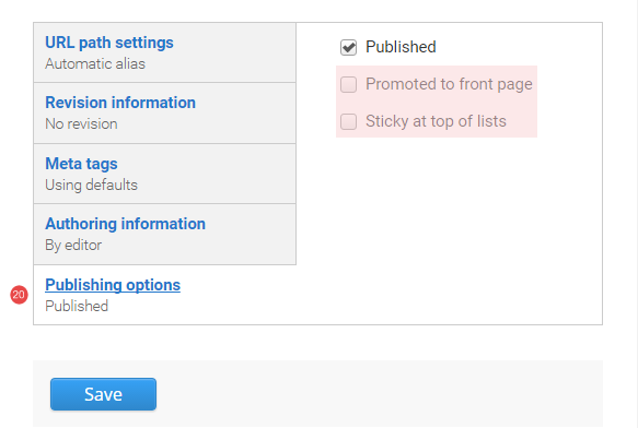
- Publishing options - Click the tab Publishing options to finalise the publishing settings.
To publish - The published field is automatically ticked. Keep it tick to publish
To create a draft - untick published to save as a draft.
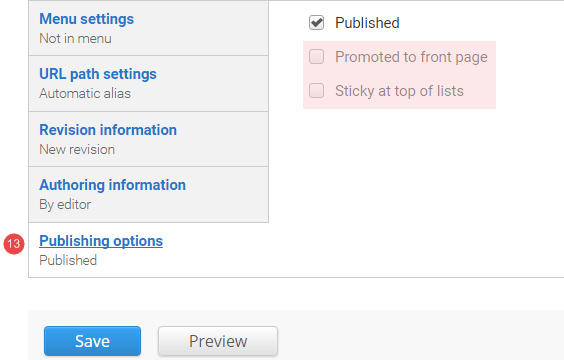
- Save - Click Save to update the basic page.
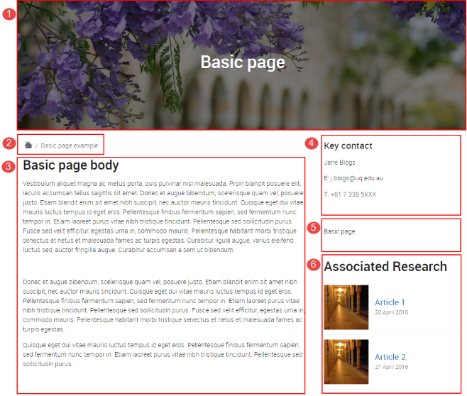
- Hero image, including the page title
- Breadcrumb. Displays when the page is added to the menu under another item.
- Body
- Aside
- Side menu. Includes siblings and child pages.
- Related content.
Headings are used to structure sections of content on a page. They enable skimming and add semantic value which is used by screen readers and search engines.
Heading levels range from 1 - 6. Referred to as h1, h2, h3, etc
Heading 1 <h1> is reserved for the page title. It should be the first heading on the page, and there should generally only be one h1 per page.
Headings provide semantic structure to a document and need to follow the numerical order. The first content heading should be h2. If that section has a sub-heading it will be a h3.
What to avoid
- Don't use bold instead of a heading as it doesn't have the same semantic meaning.
- Don't skip heading levels.
Heading 2
Heading 3
Heading 4
Heading 5
Heading 6
Guides for Task: insert links
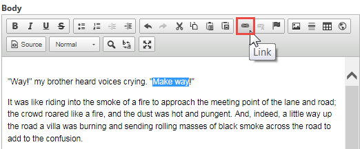
Linking to pages on the same site should always use relative path urls. Following the instructions below will insert links that are automatically updated if the page url changes.
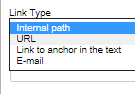
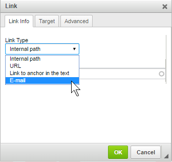
Select link type, internal path, when linking to a page on the local site.
Step 1
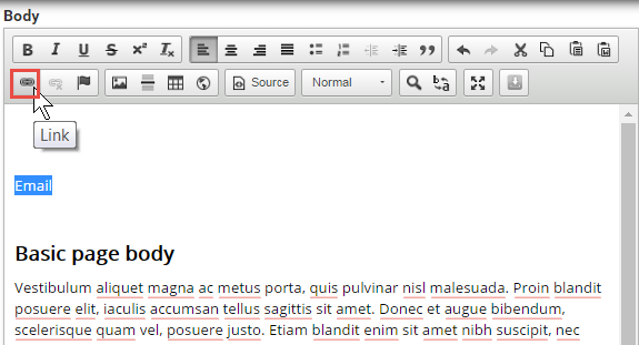
In the WYSIWYG editor select the text to link. Click the link ( ) icon to open the dialog window.
Step 2
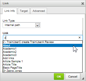
Select the option, internal path.
Step 3
Select the link type, Internal path. Start typing the name of the page that will be linked to in the Link field. The system will auto-complete available matches.
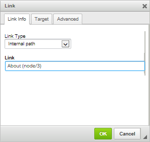
Step 4
Select the applicable page and click OK to insert the link. The page name is displayed along with the system reference in brackets.
The link is inserted.
Optional
Links such as 'read more' type links can be styled to have a chevron icon beside them by using the follow utility class.
Note that this makes the link sit on its own line so cannot be used for links within a paragraph.
arrow-link
<a href="" class="arrow-link">Read more about links</a> |
Read more about links |
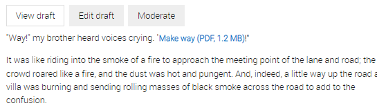
For links to files such as .pdf or .doc, include the file extension and size within the link, e.g. Download our prospectus (PDF, 20MB).
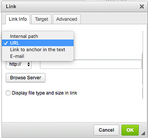
Select link type, URL when linking to a document uploaded to the local site.
Step 1
In the WYSIWYG editor select the linking text. Click the link () icon to open the dialog window.
Step 2
Change the Link Type to URL.
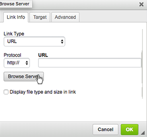
Step 3
Click Browse Server to navigate to the File Browser to select the file on the server.
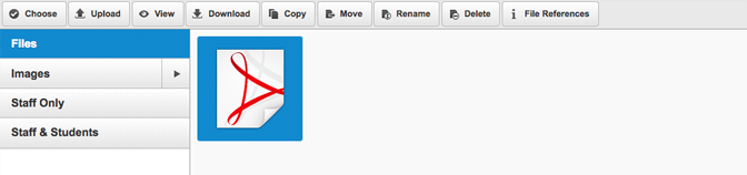
Step 4
File Browser displays. Double click on the document to link to. (See file management for instructions on uploading files.)
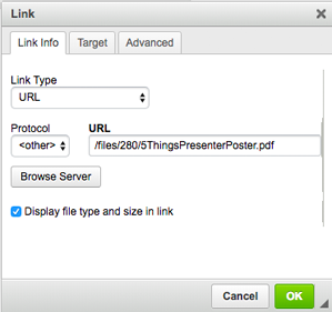
Step 5
The relative URL path for the document is inserted. Check the checkbox Display file type and size in the link to get the file information displayed automatically. Click OK to apply the link and Save the webpage.
The linked text displays.
Select link type, URL when linking to an external website.
Step 1
In the WYSIWYG editor select the text to link. Click the link () icon to open the dialog window.
Step 2
Select the option, URL.
Step 3
Select the Protocol drop-down and select the appropriate one for the external site. Enter the full URL.
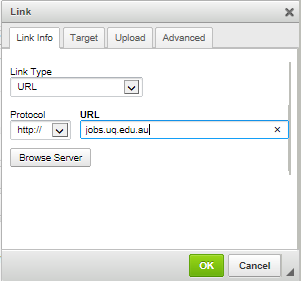
Step 4
Click OK to apply the link and Save the web page. The link dispalys.
Optional
You can provide context for users that the link goes to an external location by adding the class: link--external
This will add the external link icon to the end of the link.
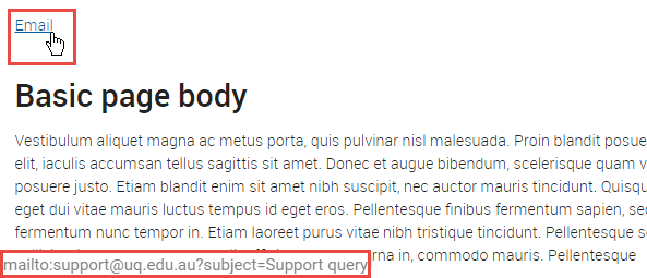
Forewarn the user if a link will open their email program. Use the link dialog box to input the email address and, if desired, the default subject and body text. Express this link as ‘Email Jane Doe’ (clear) not ‘Contact Jane Doe’ (unclear).
Select link type, email when linking to blank preset email.
Step 1
In the body field of your content type (basic page, article) select the linking text. Click the link () icon to open the dialog window.
Step 2
Select the option, email.
Step 3
Enter the following information.
- Email address of the recipient.
- Subject of the email
- Message body if there is required information to be completed.
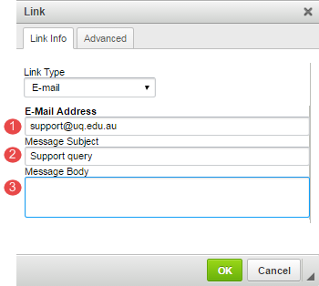
Step 4
Click OK to apply the link and Save the web page. If the mouse is hovered over the link, the recipient email and subject displayed at the bottom of the web page.
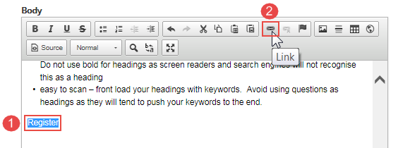
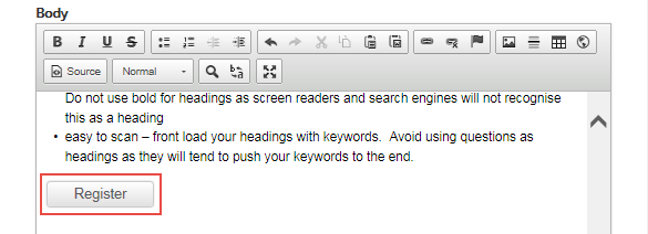
Links can be styled as buttons to bring more emphasis to them as primary actions on a page.
Generally, only 1 or 2 buttons should be used per page so the user has a clear action point. Do not use buttons for every link as this is not appropriate and leads to clutter that reduces the effectiveness of all buttons on the site.
Buttons can be added by the following methods:
Step 1
- Highlight the text to be made into a button
- Click the link icon on the WYSIWYG editor to open the link dialog window.
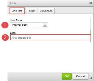
Step 2
The link dialog window appears. On the Link Info tab:
- select the link type
- insert the link path.
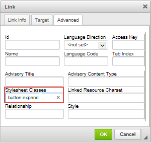
Step 3
On the Advanced Tab, enter button in the Stylesheet Classes field.
Note: classes are case sensitive.
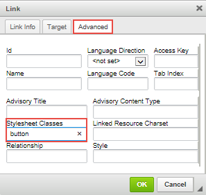
Step 4
Click OK and the button displays.
Note: the button width setting reflects the text width plus padding.
The button displays:
Making buttons display full-width
Right click on the button and select Edit Link
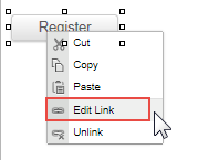
On the Advanced tab of the link dialog window, enter button expand in the Stylesheet Classes field.
Click OK and the button is saved. The button now displays at 100% width of its container.
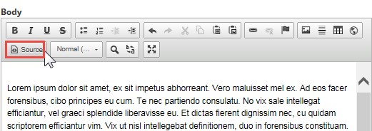
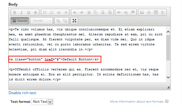
Step 1
Click Source icon in the WYSIWYG editor.
Step 2
Insert the cursor in the location where the button will display. Insert the code of the button type. In this scenario, the Default Button will be inserted using the code: <a class="button" href="#">Default Button</a>
The # symbol refers to the URL that will be inserted.
Step 3
Replace the # in the code with the URL that it should link to. In this instance, the # has been replaced with http://jobs.uq.edu.au/caw/en/listing/ and click Save.
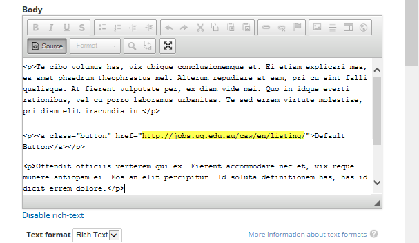
The button displays:
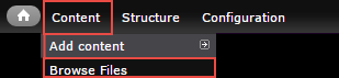
Most images and files that are displayed on the website are uploaded to the site's file browser.
The file browser can be accessed in a couple of ways:
- via the Administration menu under Content > Browse files
- via the WYSIWYG editor when inserting an image or link.
Upload via administration menu
To upload images or files to the File browser, follow the steps below.
Step 1
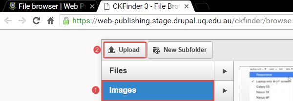
Hover over Content to expand the menu. Move the mouse pointer over Browse files and click it to open the file browser.
The file browser displays. Images and files are stored in 2 separate folders in File browser, viz. files and image
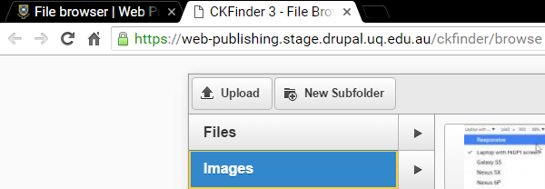
Step 2
Before uploading the image, ensure that the image tab is selected by clicking on it. Click upload to upload the file from your computer.
Step 3
The windows explorer window opens. Navigate to the location where the image is stored.
- Click on the image to select it
- Click open to upload the image.
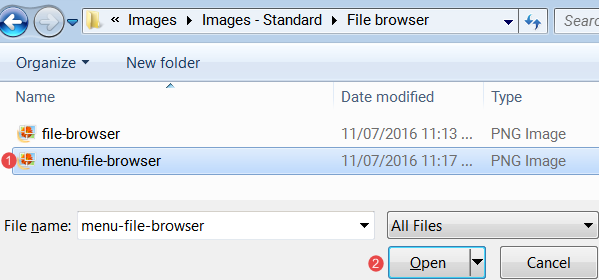
Multiple images can be uploaded at one time. Select all images before clicking open.
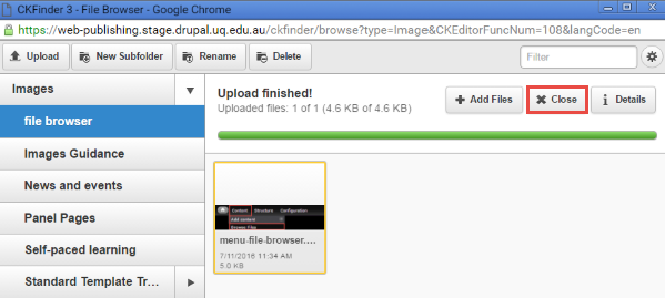
Step 4
Upload finished displays if the image is successfully uploaded. Click close to close the File browser and return to the website.
Upload & insert an image via WYSIWYG editor
In-line images can be added to the file browser while creating content using the WYSIWYG editor ( What You See Is What You Get)
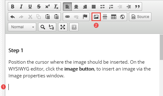
Step 1
- Position the cursor where the image should be inserted.
- On the WYSIWYG editor, click the image button, to insert an image via the Image properties window.
Step 2
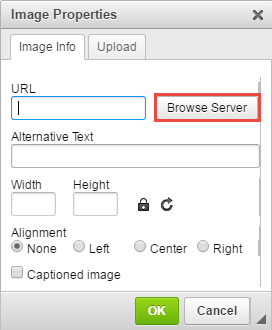
The image properties window displays. Click browse server to select an image.
Step 3
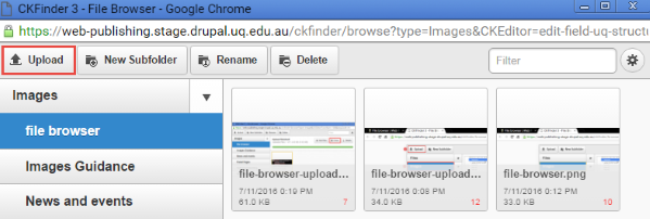
The file browser image folder displays. Select the image if it is on the server or click upload to upload an image from your computer via windows explorer or Finder for Macs.
Step 4
The windows explorer window opens. Navigate to the location where the image is stored.
- Click on the image to select it
- Click open to upload the image.
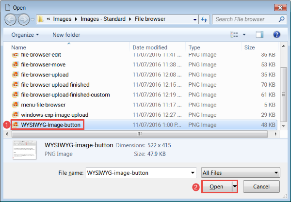
Multiple images can be uploaded at one time. Select all images before clicking open.
Step 4
Upload finished displays if the image is successfully uploaded. Proceed to Insert in-line image to insert the image.
Step 5
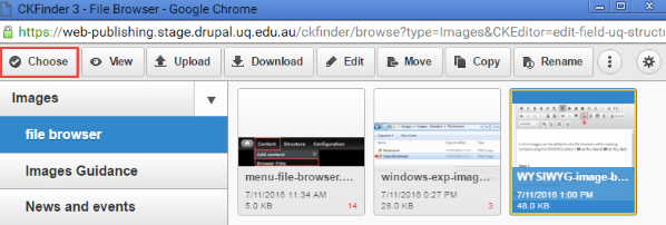
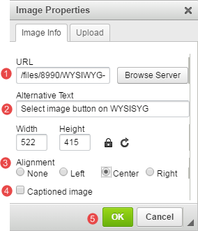
Click choose or double click the image to insert it in the body field where the cursor has been placed.
Step 6
The image properties window opens.
- relative link to the image is inserted in the URL field.
- Insert alternative text to explain the image if a caption will not be used.
- Select the alignment of the image
- Select captioned image to explain the image if alternative text will not be used. Option to add the caption will only be available after OK is clicked.
- Click OK to save the image properties.
You are returned to the body field to complete the rest of the content.
Create a subfolder
A file structure can be created in file browser to organise the stored images and files.
Step 1
Access the file brower either via the administration menu or via the WYSIWYG editor if you are creating or editing content.
Step 2
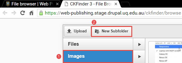
- Select the parent folder and
- Click New subfolder.
Step 3
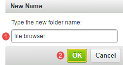
The new name pop-up displays.
- Enter a new folder name
- Click OK
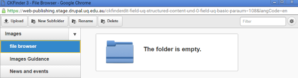
The new subfolder is added.
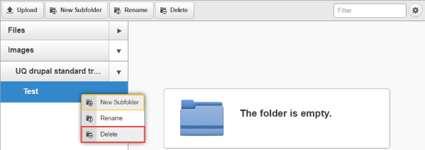
Delete subfolders
Empty subfolders that are no longer required can be deleted.
Step 1
Access the file brower either via the administration menu or via the WYSIWYG editor if you are creating or editing content.
Step 2
Right-click on the folder to be deleted and click Delete.
Step 3
Confirm that the subfolder can be deleted by clicking OK. If you are certain that you would like to delete the folder, click the OK button and the folder will be permanently removed.
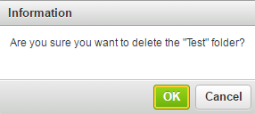
The subfolder is deleted.
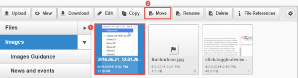
Moving files
The location of an uploaded image can be moved without requiring the image to be re-uploaded.
Step 1
Access the file brower either via the administration menu or via the WYSIWYG editor if you are creating or editing content.
Step 2
- Click on the file to be moved
- Click move
Step 3
Select the destination folder for the file.
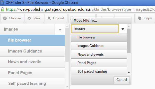
The file is moved when the folder is selected.
Rename a file
- Uploaded images can be renamed.
- If the image has been linked to, renaming it will break the link. Therefore ensure that the link is updated on the relevant page after the image is renamed.
Step 1
Access the file brower either via the administration menu or via the WYSIWYG editor if you are creating or editing content.
Step 2
- Click on the file to be renamed
- Click Rename
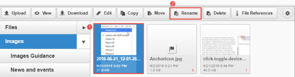
Step 3
Enter the new name and click OK
The file name will be updated.
Deleting files
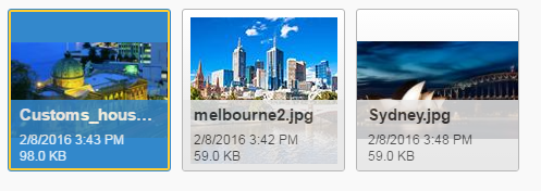
When deleting single files or images within the File Browser, make sure the file you want to delete is properly selected so that it is highlighted blue.
If the file is not highlighted blue then the actions at the top such as ‘Delete’ are actions for the folder, not the file.
Depending on what you last clicked on, a file may have only a yellow border around it which makes it appear to be selected, although it is not. Clicking ‘delete’ when a file is not properly selected could delete the entire folder and all the files within it.
Example of a correctly selected image in blue:
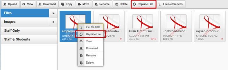
Replacing existing files
You can replace an existing file so that the file ID remains the same and all links to it will continue to work.
- In the admin menu, go to Browse files
- Select the file you want to replace (it will turn blue when selected)
- Right click on the file and select Replace File, OR select the Replace File button at the top of the screen.
- Choose the file on your computer.
- Click Replace.
Note: The uploaded file must have the same file name and type as the original file.
Accepted file types
The File browser accepts the following file types:
asf, csv, doc, docx, dot, dotx, ens, gz, gzip, mp3, ods, odt, pdf, ppt, pptx, rar, rtf, tar, tgz, txt, vsd, xml, xls, xlsx, zip, ics
The Image browser accepts the following file types:
png, jpg, gif, jpeg
Identifying large images
Images over 1MB are generally too large for website use and should be optimised. An easy way to identify large images is to sort by file size in the image browser.
- In the administration menu, go to Content > Browse files
- Click on the Images folder
- Click on the cog icon at the top right
- Change the View to List, and close the settings tab
- Click the heading of the File size column to sort by size and look for any images 1MB or over
- Follow the best practice guide to optimise images and replace them
- Repeat for any sub-folders under Images.
Guides for Task: in-line images
In-line images refer to any image added to the body field via the WYSIWYG editor as opposed to a specific file upload field such as "Teaser image".
Step 1
- Position the cursor where the image should be inserted.
- On the WYSIWYG editor, click the image button.
Step 2
The image properties window displays. Click browse server to select an image.
Step 3
The file browser image folder displays. Select the image if it is already on the server (skip to Step 5), or click upload to upload a new image from your computer.
Step 4
The window to your computer opens. Navigate to the location where the image is stored.
- Click on the image to select it
- Click open to upload the image.
- Mulitple images can be uploaded at one time. Select all images before clicking open.
Upload finished displays if the image is successfully uploaded.
Step 5
Select the image by clicking on it. Click choose or double click the image to insert it in the WYSIWYG field.
Step 6
The image properties window opens.
- Insert alternative text to describe the image for screen readers and search engines. This text doesn't display on the front-end, but is required for accessibility.
- Select the alignment of the image
- Select captioned image to display a caption below the image. The caption field will appear after OK is clicked.
- Click OK to save the image properties.
You are returned to the body field to complete the rest of the content.
Topic: Structured page
Review the guides related to creating a structured page.
Guide for Task: structured page
Structured pages are similar to Basic pages, but are designed for long content that needs to be split up into sections or steps. The majority of general content pages on a site will be either Basic page or Structured pages.
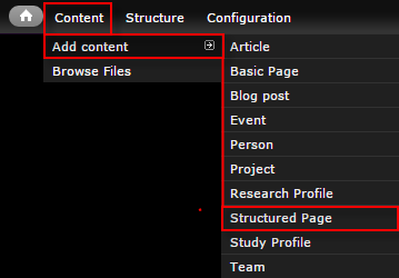
Step 1
In the administration menu, go to Content > Add content > Structured page.
Step 2
The edit screen displays.
- Title - The page title.
- Introduction - Displays above the structured content paragraphs.
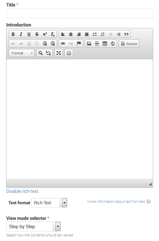
- View mode selector - Determines how the structured content fields will display.
Tabs view
Each paragraph is a separate tab. Recommend 2-4 tabs maximum.
Accordion view
Each paragraph is a separate accordion toggle. All are collapsed by default, and only one is active at a time.
Step by step view
Each paragraph becomes a step in a process and behaves like a separate page. Index of steps is listed at the top of the page, and previous/next buttons display at the bottom.
Table of contents view
Each paragraph is displayed one below the other. A jump list to each paragraph displays at the top of the page.
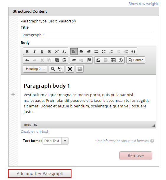
- Structured Content - Add a new paragraph for each section of content to be displayed using one of the view modes.
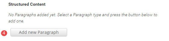
Each structured content paragraph contains a Title and Body field.
- Teaser image - Optional. Displays in card and teaser views. Advice on images.
- Hero image - Optional. Replaces the default page header with a hero banner header.
- Aside - Optional. Used for content that is tangentially related to the main page content, such reminders or contact details.
The Aside field displays.
- Related content - Optional. Allows other pages on the site to be referenced in a short list. The relationship is manually created, not inferred from any data such as tags.
The Related Content fields display.
Title - Optional. Heading to label the related pages. e.g. "Associated research", or "See also"
Related content - Reference to other pages on the site. Type the first few letters of a page title to look-up the desired page. Multiple related pages can be added.
- Tags - Click the dropdown arrow to select a tag from the list of vocabularies and their terms to categorise the content.
- Menu Settings - Tick provide a menu link to display the menu settings options. Adding a page to the menu ensures it will appear in the site map.
Enter the menu settings fields.
Menu Link Title - The menu link title is automatically populated from the page title. The menu link title can be edited.
Description - Content entered in the description field will be displayed when hovering the cursor over the menu link.
Parent Item - Selection of a parent item ensures improved website navigation by displaying a breadcrumb trail at the top of the page.
Weight - Select a weight to determine the order of the menu link in the Parent Item. Menu links with smaller weights are displayed before links with larger weights. Tip: easier to drag the links into position to change the order. Review
re-order menu links.
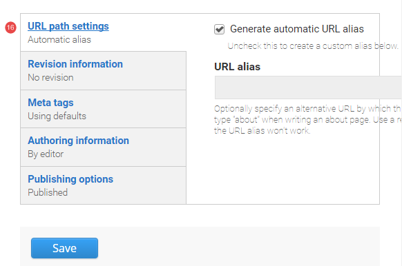
- URL path settings - a friendly URL is generated automatically if the tick box remains ticked.
- Revision Information - if create new revision remains ticked, a new version of the structured page is saved each time. The versions are accessible from the revisions tab.
- Authoring Information - The information of the author is recorded. After the structured page is saved, the "authored on field" is updated.
- Publishing Options - Click the tab Publishing options to finalise the publishing settings.
To publish - The published field is automatically ticked. Keep it tick to publish
To create a draft - untick published to save as a draft.
- Save - Click Save to update the structured page.
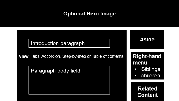
- Header - Optional hero image.
- Introduction
- Structured content paragraphs - Displayed as either; tabs, accordion, step-by-step or table of contents.
- Aside - Optional.
- Side menu
- Related content - Optional.
Topic: Person and team
Review the guides relating to creating a person and team profiles.
Guides for Task: create a person (professional and academic)
The Person content type is used to display a biograph page, most commonly for staff. People can be grouped into Teams and listed in the Staff Directory.
People can be manually added on the site, or imported automatically from authorative central data.
Imported data must be updated at its source of origin to feed through to UQ Drupal.
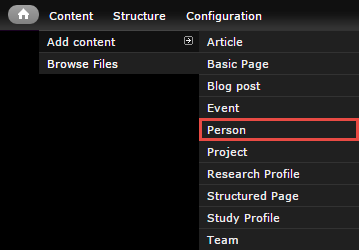
Step 1
In the administration menu, go to Content > Add content > Person.
Step 2
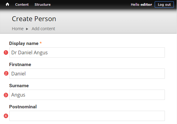
The edit screen displays.
- Display name - Full name and title as preferred for publication. e.g. Mr John Citizen
- Firstname - Used in the page url
- Surname - Used in the page url
- Postnominal
- Position - Paragraph containing multiple fields. A person can have multiple positions.
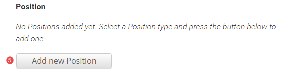
The Position fields display.
Organisation ID
Organisation Title
Position Title - Imported from Aurion.
Staff group - Optional. Groups staff by type for filtering in the Staff Directory
Phone
Fax - Imported from UQ Researchers
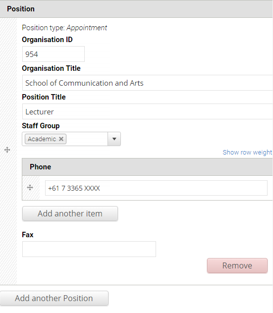
To add additional positions, click Add another Position.
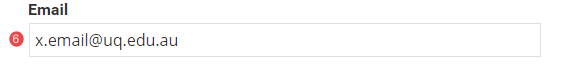
- Email - Imported from the primary email field in Webprism.
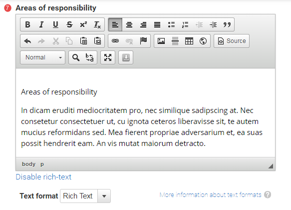
- Areas of responsibility
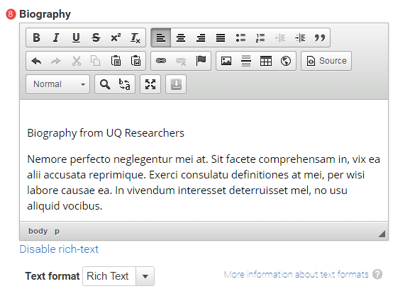
- Biography - Imported from UQ Researchers.
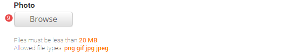
- Photo - See profile picture guidance for advice. Imported from UQ Researchers for UQ staff.
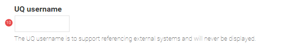
- UQ Username
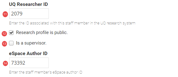
- UQ Researcher ID - Optional. Allows a link to the profile on UQ Researchers
- Research profile is public - If ticked, and a UQ Researcher ID is provided, the link to the profile will display on the Person page.
- Is a supervisor - If ticked, a paragraph is inserted in the page to provide a link to view current and completed supervisions on UQ Researchers.
- eSpace Author ID - Optional. If provided, an automated feed of publications for that author will display on the Person profile page.
- Research Area - select the research area that the researcher works in. The research areas are added as terms to the Research area vocabulary. A Site coordinator can add a term to a vocabulary. For further information about terms and vocabularies, review Taxonomy.

- URL path settings - a friendly URL is generated automatically if the tick box remains ticked.
- Revision Information - if create new revision remains ticked, a new version of the basic page is saved each time. The versions are accessible from the revisions tab.
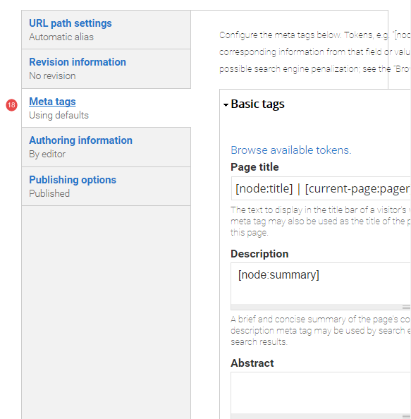
- Meta tags
- Authoring Information - The information of the author is recorded. After the basic page is saved, the "authored on field" is updated.
- Publishing Options - Click the tab Publishing options to finalise the publishing settings.
To publish - The published field is automatically ticked. Keep it tick to publish
To create a draft - untick published to save as a draft.
- Save - Click Save to update the person content type.
Finding a UQ Researcher ID
- Go to http://researchers.uq.edu.au and search for the reseacher.
- The researcher's profile page displays. The UQ Researcher ID appears at the end of the URL:
https://researchers.uq.edu.au/researcher/{UQ Research ID}
Finding an eSpace author ID
- Go to http://espace.library.uq.edu.au and search for the author.
- A list of publications by that author displays.
- Click on the name of the author in one of the results to view results for specifically that author. The eSpace ID appears at the end of the URL:
http://espace.library.uq.edu.au/list/author_id/{eSpace ID}
The feed of publications from eSpace is cached on Drupal websites for 1 hour for performance reasons.
- Display name
- Position title
- Organisation title
- Telephone
- UQ Researcher profile link
- Profile image
- UQ Researcher biography
- Areas of responsibility
- Supervision block linking to UQ Researchers
- eSpace publications
- Research areas

How does it work?
- Provide your organisation unit ID.
- A number of profiles of the staff who have a position in your organisation unit will be created on the site. Casual and part-time staff can be ignored at your request.
- A daily import will be triggered automatically every night to ensure the profiles on the website are kept up to date.
If you wish to import person profiles to your sites, please send your request to webservices@uq.edu.au.
Where does the data come from?
The data comes from the UQ HR system. All imported data will be locked and cannot be overridden. If you wish to update any personal or position details, please contact HR to update the corresponding staff record.
Can I still use custom profiles on my site?
Yes. If you wish to create a custom profile for your staff, please unpublish (not remove) the imported profile to ensure no duplicated profiles are published at the same time. Any profile which is created manually will not be overridden by the daily import.
Any removed profiles will be re-created during the daily import, therefore we recommend you to unpublish instead of deleting the imported profile if you wish to replace an imported profile with a custom created profile.
Guides for Task: create a team (professional and academic)
Teams are manually managed groups of people. They can be used to represent organisational structure, research teams, or any other ad-hoc grouping.
It is recommended to create people pages first, and then create the teams to assign them to.
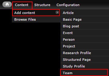
Step 1
In the administration menu, go to Content > Add content > Team.
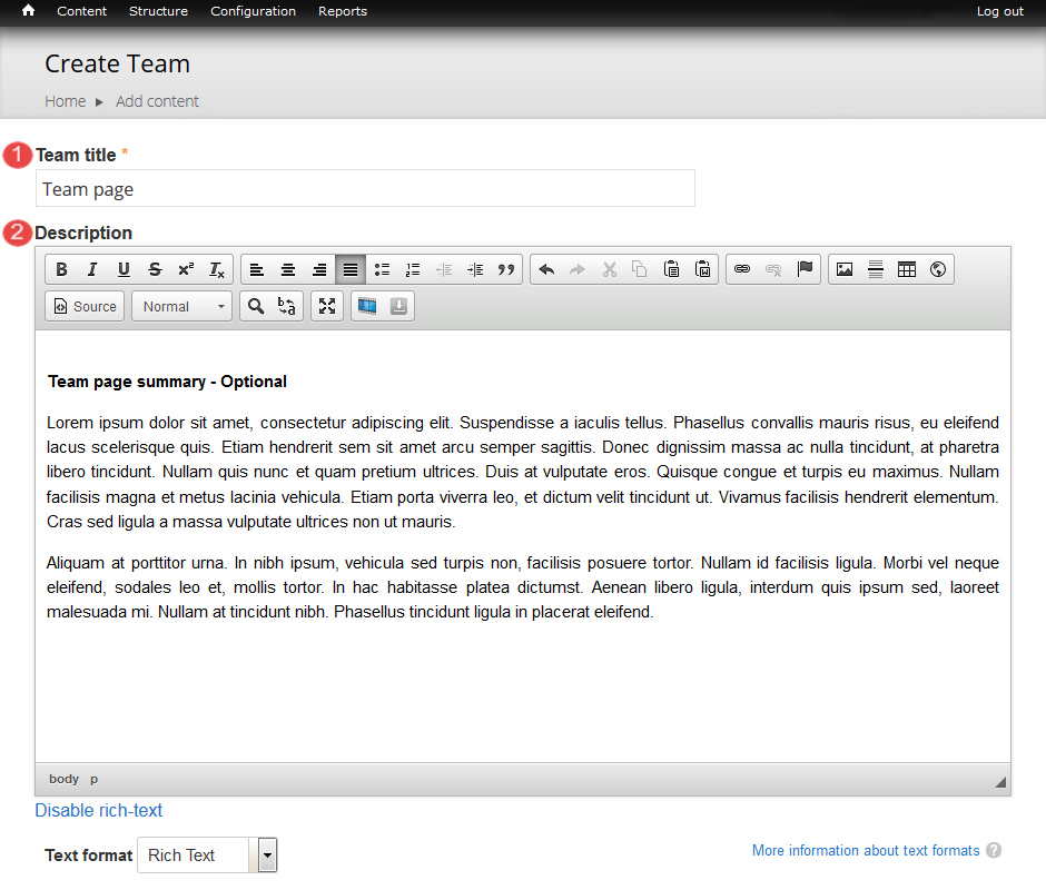
Step 2
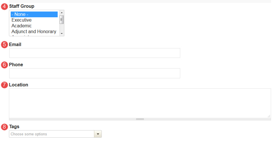
The edit screen displays.
- Title - Page title
- Description - Optional. DescibDescribeseam's role, purpose, etc.
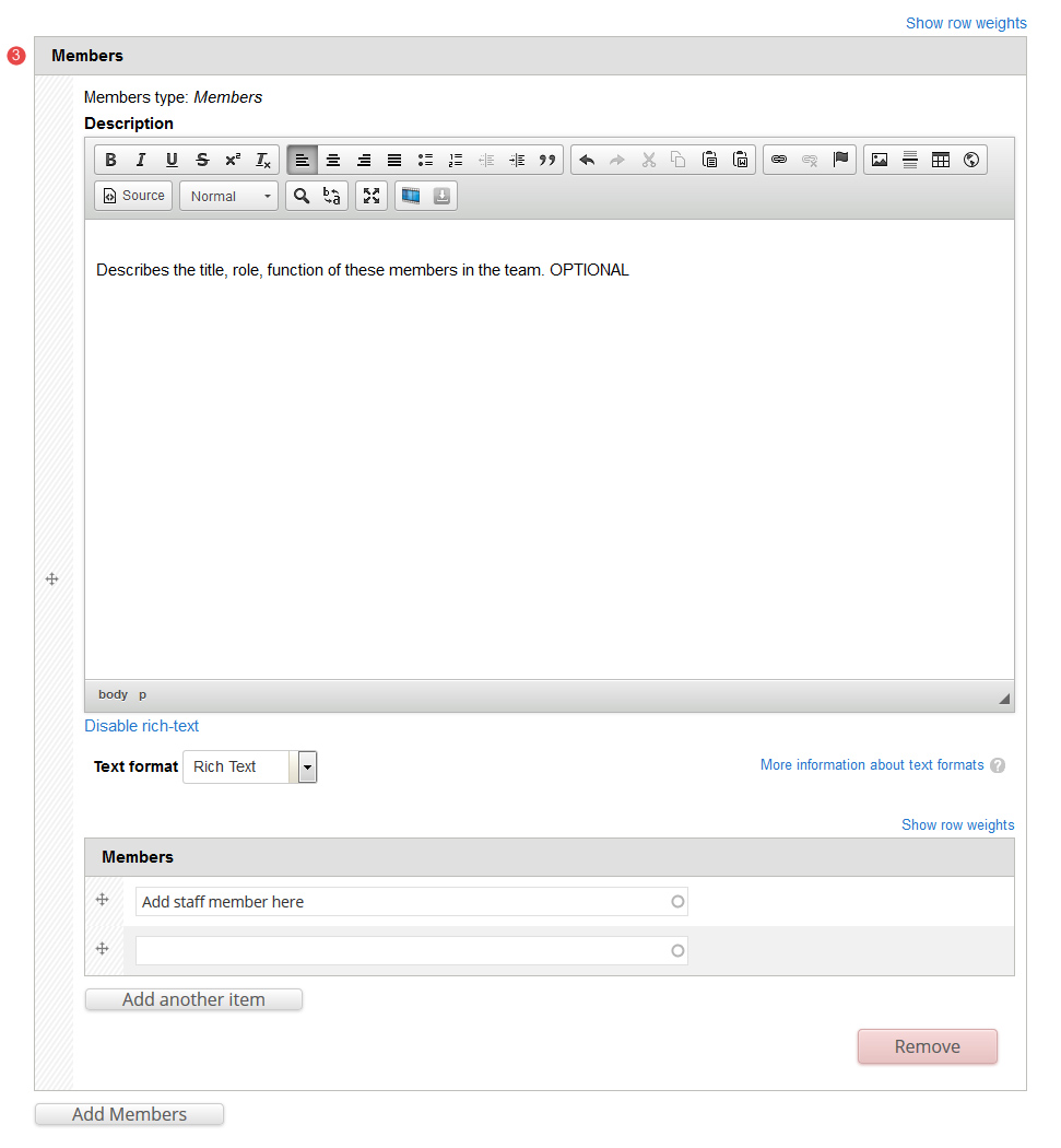
- Members - Multiple groups of people can be added to a team.
- Description - Optional. Describes the title, role, function of these members in the team.
- Members - Entity reference to each Person node. Order is set manually by dragging.
- Staff group - Optional. Categorise the Team to allow sorting/filtering on listing pages such as the Staff Directory.
- Email - Optional. General contact email for the team. e.g. team-name@org.uq.edu.au
- Phone - Optional. General team phone number.
- Location - Optional. Physical location of the team if they are accessible publicly.
- Tags - Click the dropdown arrow to select a tag from the list of vocabularies and their terms to categorise the content.