Tabs (Quicktabs)
This functionality requires Site Builder permissions.
Tabs functionality is provided by the Quicktabs module.
2. Adding content to tabs
Each tab contains one object. Three common objects added to tabs are:
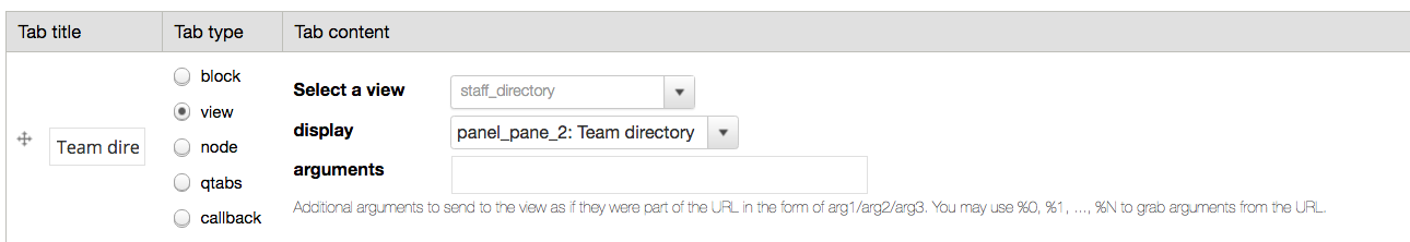
1. A view
Views can be added as a tab item, which help display dynamic information for your page.
To achieve this you will need to set the Tab type to view and Select the view you are planning to use from the dropdown.
Some views have multiple display modes. If this is the case, all of the display modes will be listed under the display dropdown.
The argument field is optional, and can be used to filter the view to a particular taxonomy group (if the view supports taxonomy filters).
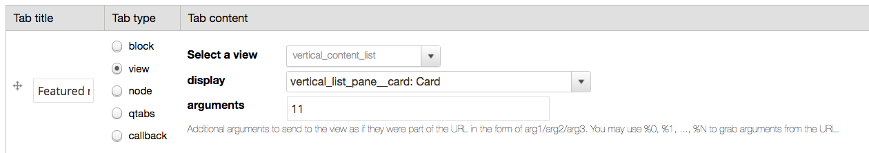
Not all of the display options of a view are available when adding a view to a tab. If you need to configure further filtering, such as choosing chich content types to display, the view should be added to a mini panel and the mini panel added to the tab.
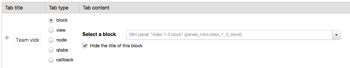
2. A mini panel
More complex layouts can be added through a mini panel as a tab item. This is needed for particular layouts and views that require certain filters. For example a Vertical Content List view filtered by Article would need to be placed inside of a mini panel in order to specify that particular filter.
Select block for the Tab type and then select your mini panel.
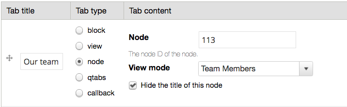
3. A node page
This allows you to display the content of any node page in a tab.
Select node for the Tab type and enter the node ID in the Node field.
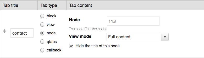
The default view mode is "Full content" but for some content types, such as Team, this isn't always suitable.
For Team nodes, the "Team members" view mode is often more suitable.