Drupal 7 components
Understanding components
Drupal 7 has several page types including basic pages, structured pages and panel pages. Panel pages are made up of components, which provide specific layout and functionality for displaying content on a panel page.
Depending on your level of access, you can edit some components on a panel page.
Learn more about:
Learning outcomes
At the end of the topic, you will be able to:
- update the image and text of the hero component
- update the body field of the rich text component
- distinguish between the section pane fields (section title, section summary content, section footer content, background image) and the body field of the rich text component
- update the title, image, content, primary link and action link (title and URL) fields for the custom card paragraphs in the card grid component
- explain when to use a relative path link and the absolute path link
- identify the key factors to consider when selecting an image.
Tasks to complete
For this topic, you are required to complete 3 tasks:
2. Edit a rich text component
Essential guides
Check these guides before completing the task.
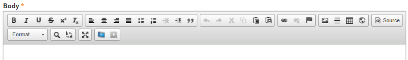
- Rich text field – what a rich text field is and what content it can contain.
- WYSIWYG editor – understanding the fields in the WYSIWYG (what you see is what you get) editor.
Editing a rich text field
Step 1
Hover the mouse pointer over the right-hand corner of the Rich Text pane to display the Edit cog ( ). Click the icon to display the menu and click Edit to open the Rich Text form.
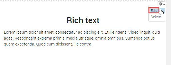
Step 2
The configuration form for the rich text component displays.
- Title - do not edit the title of the component.
- Body - edit to update the content.
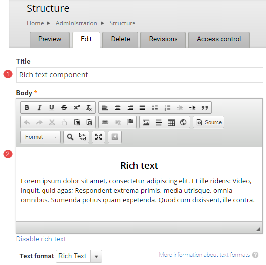
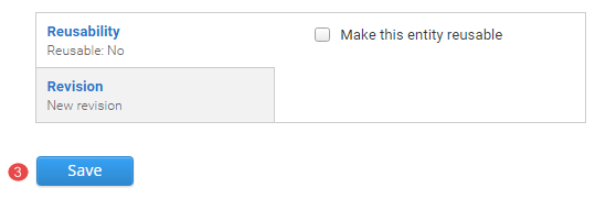
- Click Save to accept the changes
Task instructions
Use the same page you used in the hero banner task to edit the rich text field.
Follow the numbered actions below before saving the changes.
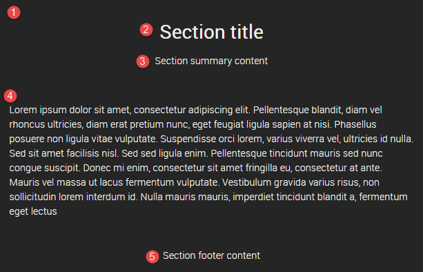
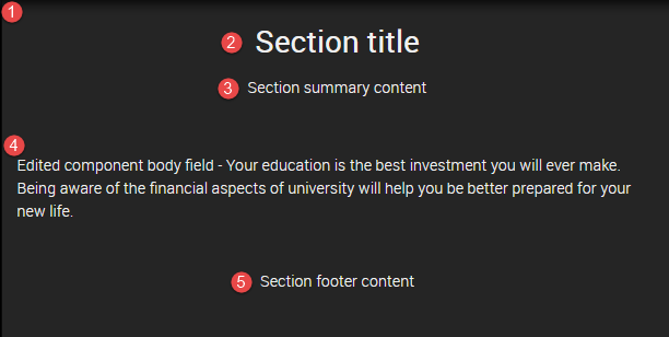
1. Review the rich text component titled Rich text component - section title. The numbered items refer to content in the following fields:
- background image field of the section pane style
- section title field of the section pane style
- summary content field of the section pane style
- body field of the rich-text component
- footer content field of the section pane style
2. Edit the rich text component. Refer to the Editing a rich text field guide if required.
Consider which of the fields listed above (1-5) are available for you to edit.
3. Replace the text in the body field (4) of the rich text component with the following shaded text:Edited component body field - Your education is the best investment you will ever make. Being aware of the financial aspects of university will help you be better prepared for your new life.
4. Save the changes to the rich text component.
Review your rich text component
Compare your edited rich text component with the following exemplar.
The following information applies to the image below.
- When editing the rich text component the only available field to edit is the body (4) field of the component.
- The background image (1) and the text - section title (2), section summary content (3) and section footer content (5) are populated by fields that form part of the section pane style. Only a site builder can change and edit the section pane style.
Avoid using Microsoft Edge for Drupal training.