3. Basic page
Basic pages and structured pages will form the majority of general content pages on your site.
The basic page offers the simplest type of page and is suitable for:
- a single topic
- content that can be displayed to the user in a single view.
For the basic page topic, there are 3 tasks, each of which require the following:
- Create a basic page.
- Complete the instructions for each basic page
- Publish the basic page
After completing each basic page, there is a review stage that consists of the following:
- Compare your published basic page with the Review associated with the task.
- Review Training page 2 on your training website where a view has been inserted to display basic pages that have the tag, sample basic page, added.
Learning outcomes
At the end of the topic, you will be able to:
- Create a basic page
- Insert content
- Insert links
- Insert in-line images
- Apply best practice to edit content
- Use the WYSIWYG editor
- Publish content.
6. Review: in-line images
Compare your basic page with the following:
- Published basic page
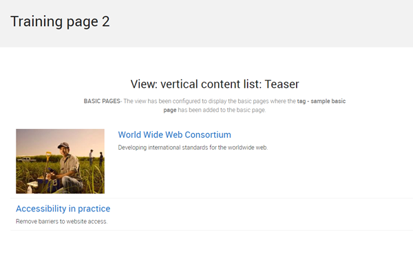
- Component display on Training page 2- view: vertical content list: teaser
Published basic page
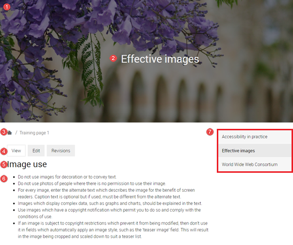
The numbered information that follows refers to the image below.
- Hero image - background hero image inserted.
- The page title is styled as heading 1 (H1) and the headings in the body field uses H2 to H6.
- Breadcrumb - the breadcrumb appears because the menu link was added to the basic page via the Menu options when creating the basic page.
- Page tabs
- View - displays the published page
- Edit - editable version of the page.
- Revisions - list of saved versions of the page at different times.
- Heading Elements - Image use is heading 2 while Example 1 and Example 2 are heading 3.
- List - The list describing how the use of images should be an unordered list since it does not reflect a sequence of steps.
- Menu links to sibling and children pages.
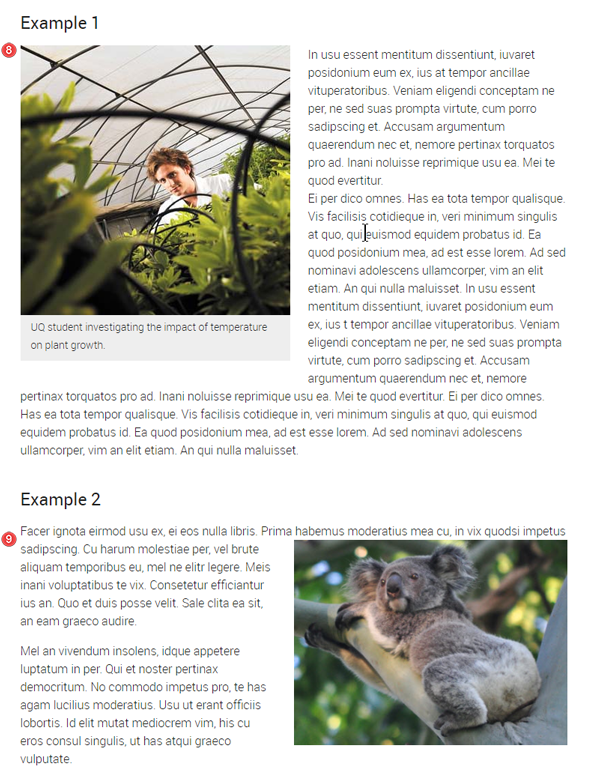
- Images - example 1 - left aligned image with alternative text and a caption
- Images - example 2 - right aligned image with alternative text and no caption
Component display on Training page 2- view: vertical content list: teaser
Purpose: to show you what happens if you do not tag your content. This view has been configured to display the teasers of basic pages where the tag - sample basic page has been added.
The basic page, Effective images,
- does not display in the vertical content list: teaser because the tag - sample basic page was not added
Click the grey button on the right to proceed to the next task.
Checklist: UQ Drupal Fundamentals
Avoid using Microsoft Edge or Internet Explorer for Drupal training.