UQ Drupal 7 site builder training - panels and components
To be granted site builder access to Drupal 7, you need to complete fundamentals and site builder training before requesting access.
Ensure you're familliar with the Drupal 7 roles available before commencing training.
Resources
Avoid using Microsoft Edge for Drupal training.
Schedule approximately 3 hours to complete this online course.
You'll need access to:
- a computer, preferably with 2 screens
- earphones for listening to the video.
Download each of these files to help you complete training:
- UQ Drupal Site Builder resources (ZIP, 4.8 MB) – download and save the images as they are required for the training exercises.
- UQ Drupal Site Builder Training Manual (PDF, 590.2 KB) – this manual has exercises that you need to complete. All exercises must by successfully completed to achieve competency in this course.
How to complete training
- Watch the site builder video tutorial. If required, access the guides related to each exercise below.
- Go to the Drupal 7 training sandbox and log in using your staff login.
- Complete all the exercises in the UQ Drupal Site Builder Training Manual.
Upon completion the sandbox should contain your panel page and all the training exercises should be evident in the sandbox website.
The following exercises are covered in the video:
- Create a panel page (starts at 2m49s)
- Create a hero banner (starts at 11m09s)
- Create horizontal content list (starts at 15m35s)
- Create a card grid (starts at 20m32s)
- Vertical content list: card compact (starts at 29m40s)
- Grid of links (starts at 36m48s)
- Insert a content column block (starts at 39m17s)
- Create a mini panel (starts at 42m47s)
Training guides
Exercise 1 guide - Create a panel page
Create a panel page
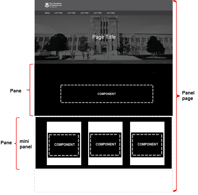
Panel pages are flexible layout pages used as landing or major section pages for the top level navigation within a website. Unlike content types, they are made up of specialist panes (components) that act like building blocks, instead of data fields.
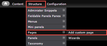
Step 1
In the administration menu, go to Structure > Pages > Add custom page
Step 2
The page displays. Complete the numbered items and click continue to move to menu settings.
- Administrative Title - Provide an administrative title so that it can be found in the administrative interface.
- Administrative description - If it is not obvious, it may be beneficial to describe the purpose of this page.
- Path - Insert the name for the path. Ensure it is related to the content on the page.
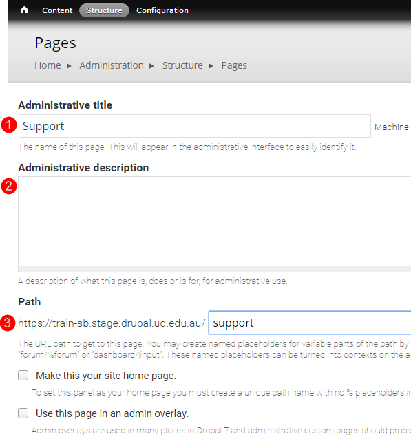
- Make this your site home page - This box should only be ticked if the page you are creating is the home page. Otherwise, leave it unticked.
- Variant type - Retain the default, panel.
- Optional features - While you can tick visible menu item, it is best not to because the menu link cannot be deleted later if necessary.

Click Continue to Choose layout.
Step 3
Click the Category drop-down to select UQ Pages .
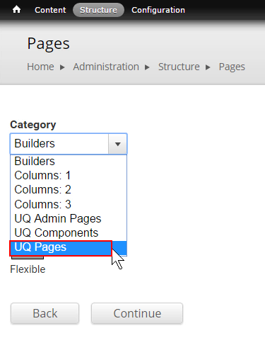
Step 4
In this example, select the single column full width option and click Continue to proceed to the panel layout. The layout defines the regions where the components can be added.
Tip: Other potential layouts are the sidebar right and sidebar left.

Step 5
Select In-Place Editor (IPE) as the renderer click Continue to proceed to panel content. By selecting this renderer, the "Customise this Page" button will appear at the bottom of the landing page when the site builder is logged in.

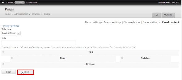
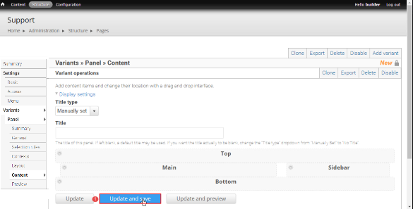
Step 6
Click Finish before adding content to the regions.
Step 7
Click Update and save and when the save is complete, click Menu in the left-hand menu.
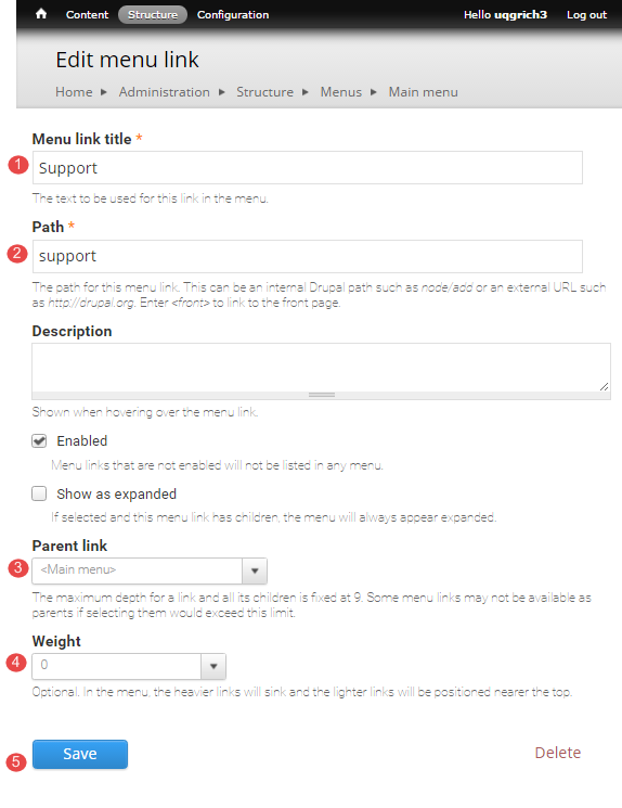
Step 8
In the administration menu, go to Structure > Menus > Main Menu > Add link and enter the details
- Menu link Title - the title will appear as the menu link in this menu to the landing page
- Path - enter the path for the page. For this example, it is - support
- Parent link - select the parent of the page. In this example, it is at the top level of the Main Menu.
- Weight - it is not necessary to enter a weight since the order of links can be manipulated later.
- Click Save.
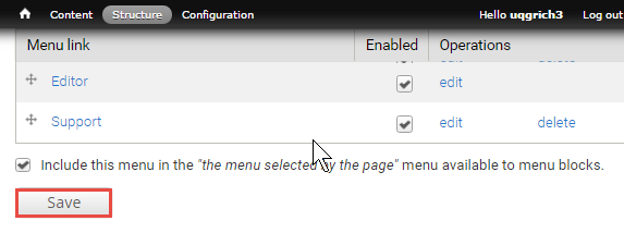
Step 9
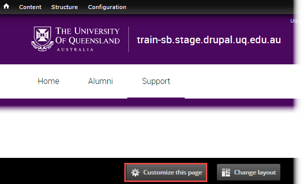
The main menu opens. Click Save. To navigate to the new page, click hyperlink name, in this example it is Support.
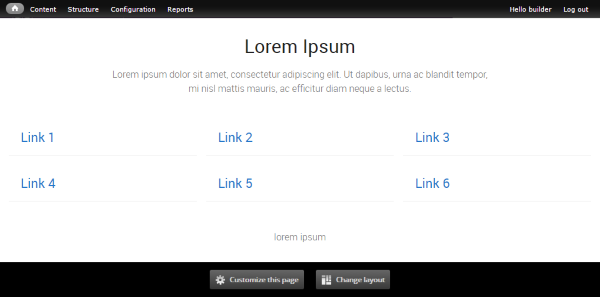
The newly created panel page displays and is ready for adding components. Proceed to the list of components links for instructions to insert the components on the panel page.

Find a list of panel pages
The list of all Panel pages on the site is separate to the list of node pages you find under Content in the administration menu.
Step 1
In the administration menu, go to Structure > Pages

The list of Panel pages displays.
Do not edit, disable or enable pages of the Type (System) or Custom.
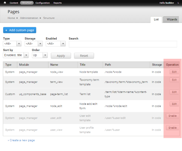
Step 2
To navigate to the panel page, click the linked path.
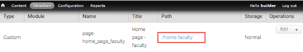
How do I find my panel page?
To access the list of panel pages on your website follow these steps:
- Go to Structure > Pages to display the list of panel pages.
- Scroll to your page
- Click the hyperlinked path to go to the page or click edit to open the backend of the page.
Only edit panel pages created by site builders in your organisational unit.
Exercise 2 guide - Create a hero banner
Create a hero banner
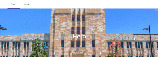
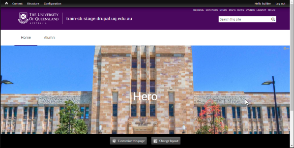
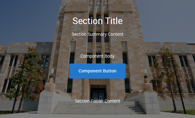
The Hero Banner is a page title component for Panel pages. It outputs a <h1> element for the page title overlaying an image, and can optionally have 1-3 action buttons. Only one Hero Banner should be used per page and it should ideally be the first component on the page.
Step 1
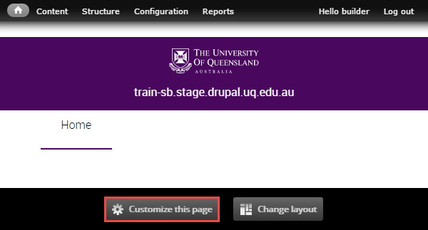
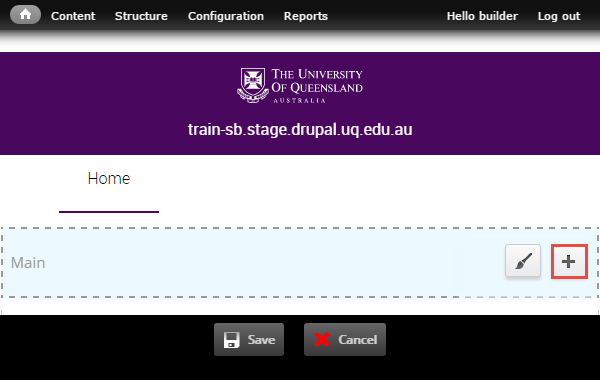
Click Customize this page to start adding components to a panel page.
Step 2
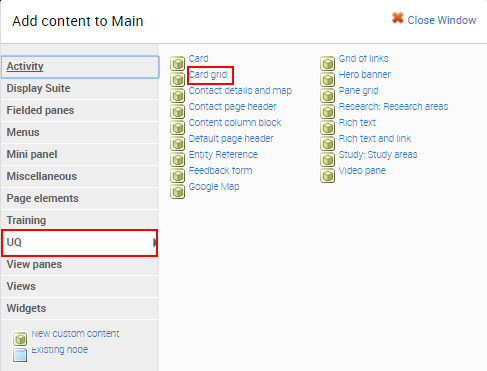
The available regions where components can be added are displayed as blue shaded fields. Click the plus (+) button to open the list of available components grouped by category.
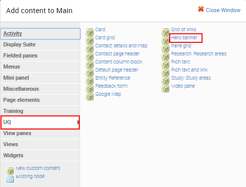
Step 3
The available components display. Click on the UQ category and then select the Hero Banner component to open the configuration form.
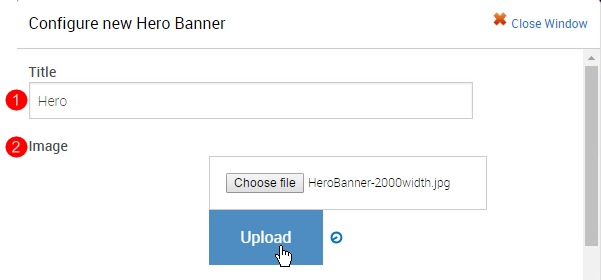
Step 4
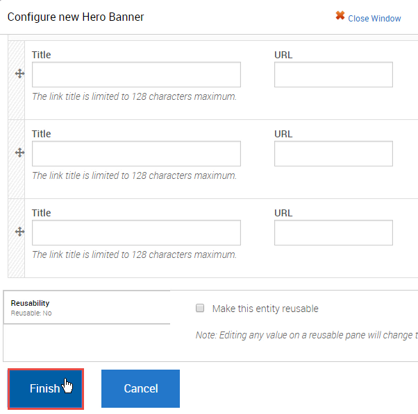
The configuration form for the Hero Banner displays. Complete the fields before clicking Finish.
- Title - insert a title for the component
- Image - select an upload an image from your computer
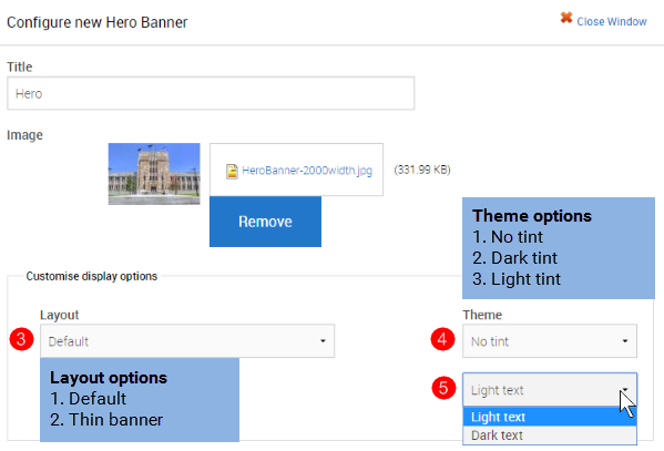
- Layout - retain the default banner or select a thinner banner.
- Theme - retain the theme or add a dark or light tint.
- Text - retain light text or change to dark text
-
If the Hero banner has three links, insert the title and URL for the links and click Finish.
Tip: Use a relative reference when linking to content on your website.
Step 5
The system returns to the panel page In-Place Editor. Click Save to complete process of adding the component.
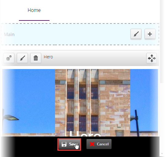
The completed component displays.
Exercise 3 Guides - Create a horizontal content list
Create a horizontal content list
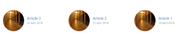
This component automatically lists the latest 3 Articles and/or Blog Posts.
Example
Step 1
Click Customize this page to add the horizontal content list view component to a panel page.
Step 2
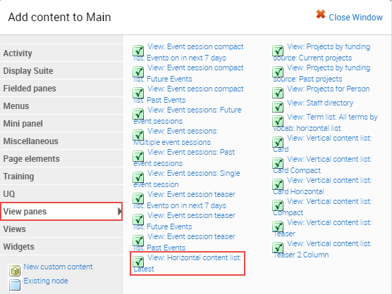
The available regions where components can be added are displayed as blue shaded fields. Click the plus (+) button to open the list of available components grouped by category.
Step 3
The available components display. Click on the UQ Content Types category and then select the view: horizontal content list: latest t to open the configuration form.
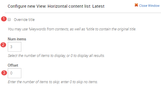
Step 4
The configure new view: horizontal content list: latest displays.
- Overide title - NOT APPLICABLE
- Num items - retain 3 as the number of items to display
- Offset - retain 0 to skip no items or enter the number of recent items to skip.
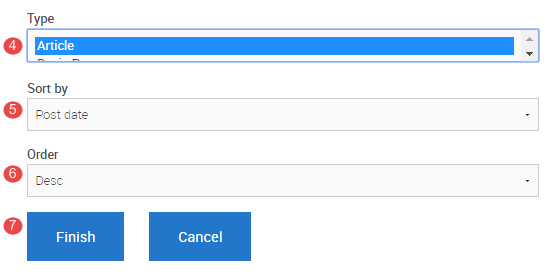
- Type - Select the content type to display. Usually it is Article
- Sort by - Select one of the options.
Post date - date the content type is saved
Publication date - date selected on the publication date field on the article content type
Title - alphabetical ordering by article title. - Order - sort by field can ordered in an ascending or descending order.
- Click Finish after completing the configure new view form
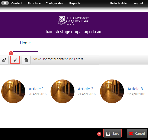
Step 5
The system returns to the panel page In-Place Editor.
-
Add Pane Styling to edit the display of the component on the panel page. Refer to the instructions, Add Pane Style.
-
Click Save to complete the process of adding the component.
Add pane style
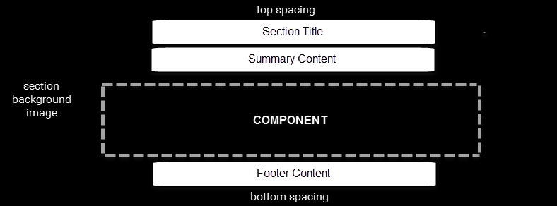
Component panes added to Panel pages by default use a pane style called 'No Title'. The Section pane style is a wrapper for each pane that adds additional fields and theming options. They allow content to broken up into 'strips' down the page to aid legibility and design.
Sections constrain the width of the component pane they wrap to the central content column. This is primarily used on full-width page layouts.
Some component panes such as the Hero Banner and Default page header are designed to display full-width and should not be wrapped in a Section pane style.
Only the Site Builder can change and edit the pane style.
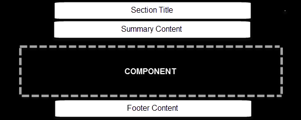
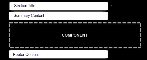
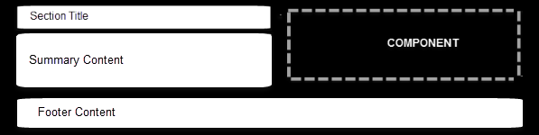
Section pane style adds the following fields and theme options; all of which are optional or configurable.
- Section title (heading)
- Summary content
- Footer content
- Top and bottom spacing
- Top and bottom can be configured separately
- Default, large, extra large or no padding options.
- Pre-defined background colour and textures
- Background image
- Optional parallax background image style. Suitable for images that show depth such as aerial or landscapes.
- Section text colour (dark or light) - to provide contrast against the background options.
- Section alignment layouts
Example
Step 1
Click Customize this page to start editing the page.
Step 2
Click the paint brush button on the component to open the pane style form.
Step 3
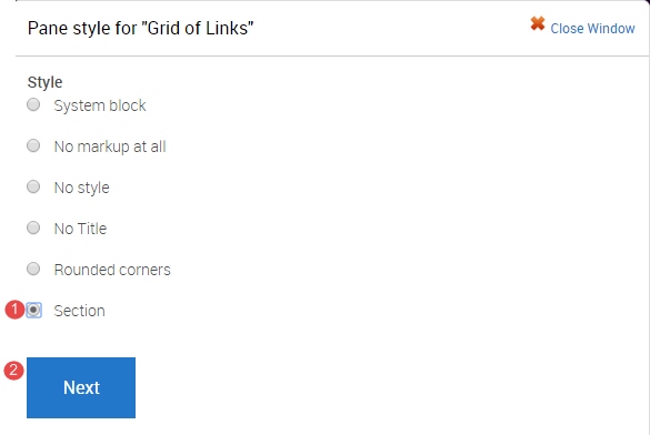
The "Pane style" form displays.
- Selection Section
- Click Next
Step 4
It is optional to enter content in the Style settings fields. The contents in the fields will display in the pane as shown in the image below.

- Section Title
- Title element - Select the heading style from the range h2 to h4. The default is h2.
- Summary content
- Footer content
- Background image (Optional)
Images should support the content. Avoid busy images that make the component content difficult to read. Aim to use textures or photos with a single point of focus.- Click Choose file and select an image from your computer.
- Click Upload
- Top spacing
- Bottom spacing
- Theme - If a background image was used, a dark or light tint can be applied to improve contrast for the Section and component pane content.
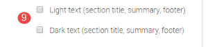
- Text colour - The text colour selection only applies to the Section Title, Summary Content and Footer Content fields. Select either light or dark text.
Components generally provide their own theme options to manage text colour.
Note: To change the colour of the content inside the section to light you will have to apply the css class light-palette to the component through the edit panel interface.
-
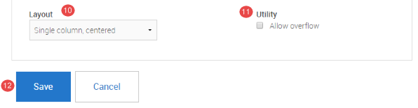
Layout
There are three (3) options for layout.Single column, centred
Single column, left-aligned
Two column, left-aligned
-
Utility
-
Allow overflow - Used when a Section pane style wraps a component containing a drop down list that extends below the height of the Section, so that the drop down is not cut off. This has some design implications for tints used on the Sections so double check the display if using this option.
-
-
Click Save to accept the pane style settings.
Step 5
The system returns to the panel page In-Place Editor. Click Save to complete process of styling the component.
The completed component displays.
Exercise 4 Guides - Create a card grid
Create a card grid
Use this component when it’s necessary to highlight content that requires the user to navigate to a sub-page for further detail. Images should have a similar tone and treatment to visually unify the panel.
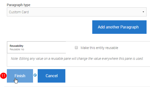
Cards can be added as either custom cards where all fields are manually set, or as node references where the content of the card comes from the node page being referenced.
Step 1
Click Customize this page to add the card grid component to a panel page.
Step 2
The available regions where components can be added are displayed as blue shaded fields. Click the plus (+) button to open the list of available components grouped by category.
Step 3
The available components display. Click on the UQ category and then select the Card Grid component to open the configuration form.
Step 4
The configuration form for the Card Grid displays.
- Title - insert a title for the component. This assists in identifying the component on the Panel Content page.
- View mode - For the view mode consider:
a. the type of card - default, compact or overlay
b. the column layout for displaying the cards - select 2, 3, 4 column or horizontal card
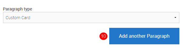
- Paragrah type - there are two types. For custom card the title, summary and link can be inserted. If node reference is selected, node (e.g. basic page) title, teaser image and URL are used for the card.
a. Select custom card to insert a title, summary and link and proceed OR
b. Select node reference to select a node to display as a card.
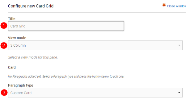
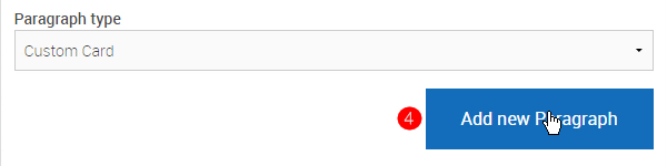
- Click Add new Paragraph to start completing the first custom card.
-
Title - Limit the title length, so that it does not exceed 3 lines on the card.
- Image - recommended width is 640px X 640px. Ensure the image is relevant to the topic of the card.
- Content - (optional) brief summary of up to 20 words.
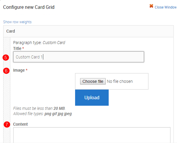
- Primary Link - used to create the hyperlinked card title.
A. Click Search
B. Type in a minimum of 3 letters of a word in the Search for content field.
C. Select the Content from the list of suggested content
D. Click Insert Link.
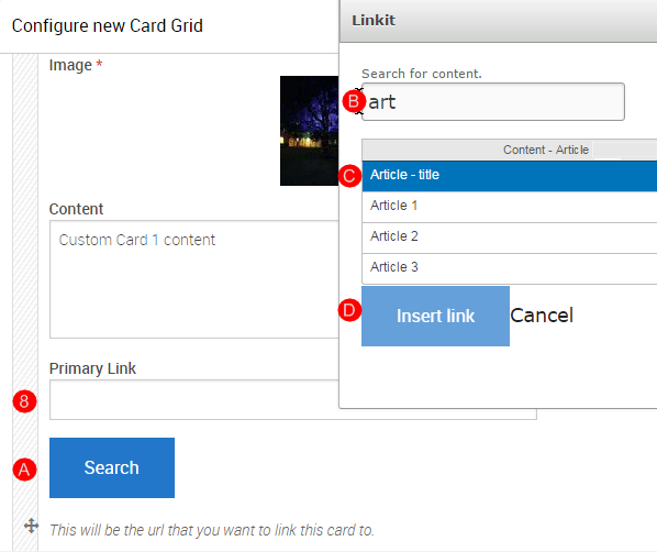
- Action Links - secondary links on the card. Can be used for further information or calls to action. If linking to content on the website, follow the Step 8 above to insert a relative reference.
Note
A. If the relative reference is used, the title field will display the title of the content that is linked to.
B. If an absolute reference is used, for content that does not exist on your site, type in an appropriate title and enter the absolute URL in the URL field.
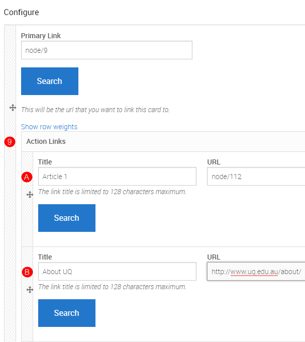
- Click Add another Paragraph to add cards 2 and 3. Follow the guidance outlined in numbers 3-9 of Step 4 to complete the required fields for each card.
-
Click Finish to save the configured card grid (column card) and return to the panel page.
Step 5
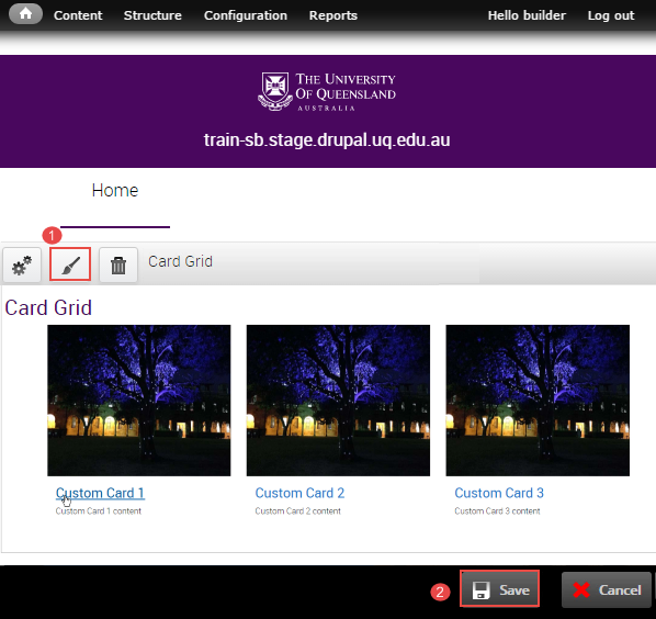
The system returns to the panel page In-Place Editor.
-
Add Pane Styling to edit the display of the component on the panel page. Refer to the instructions, Add Pane Style.
-
Click Save to complete the process of adding the component.
Add section pane style
Step 1
Click Customize this page to start editing the page.
Step 2
Click the paint brush button on the component to open the pane style form.
Step 3
The "Pane style" form displays.
- Selection Section
- Click Next
Step 4
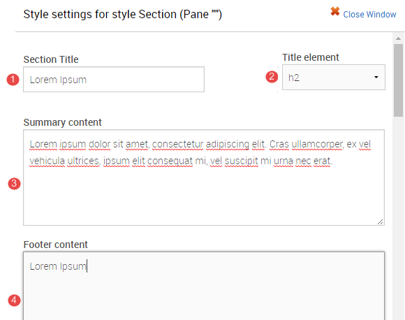
It is optional to enter content in the Style settings fields. The contents in the fields will display in the pane as shown in the image below.
- Section Title
- Title element - Select the heading style from the range h2 to h4. The default is h2.
- Summary content
- Footer content
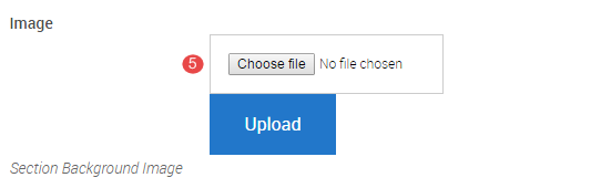
- Background image (Optional)
Images should support the content. Avoid busy images that make the component content difficult to read. Aim to use textures or photos with a single point of focus.- Click Choose file and select an image from your computer.
- Click Upload
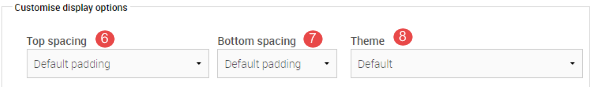
- Top spacing
- Bottom spacing
- Theme - If a background image was used, a dark or light tint can be applied to improve contrast for the Section and component pane content.
- Text colour - The text colour selection only applies to the Section Title, Summary Content and Footer Content fields. Select either light or dark text.
Components generally provide their own theme options to manage text colour.
Note: To change the colour of the content inside the section to light you will have to apply the css class light-palette to the component through the edit panel interface.
-
Layout
There are three (3) options for layout.Single column, centred
Single column, left-aligned
Two column, left-aligned
-
Utility
-
Allow overflow - Used when a Section pane style wraps a component containing a drop down list that extends below the height of the Section, so that the drop down is not cut off. This has some design implications for tints used on the Sections so double check the display if using this option.
-
-
Click Save to accept the pane style settings.
Step 5
The system returns to the panel page In-Place Editor. Click Save to complete process of styling the component.
The completed component displays.
Exercise 5 Guides - Create a vertical content list: card compact
Create a vertical content list
Vertical content list views are used to automatically display a number of node pages in a vertical list, based on configurable filters.
There are number of different views which display the listed nodes using different view modes.
Step 1
Click Customize this page to add the View: Vertical content list: Card Compact component to a panel page.
Step 2
The available regions where components can be added are displayed as blue shaded fields. Click the plus (+) button to open the list of available components grouped by category.
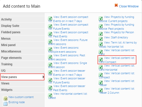
Step 3
The available components display. Click on the View panes category and then select the View: Vertical content list: Card Compact to open the configuration form.
Step 4
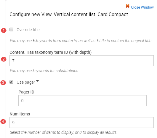
The configure new view: horizontal content list: latest displays.
- Overide title - NOT APPLICABLE
- Content: Has Taxonomy term ID (with depth) - insert the ID related to the term by which the view is filtered. Find the Taxonomy term ID
- Use pager - if more than 9 items will display, allow additional content to display on subsequent pages.
- Num items - retain 3 as the number of items to display
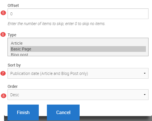
- Offset - retain 0 to skip no items or enter the number of recent items to skip.
- Type - Select the content type to display.
- Sort by - Select one of the options.
Post date - date the content type is saved
Publication date - date selected on the publication date field on the article content type
Title - alphabetical ordering by title. - Order - sort by field can ordered in an ascending or descending order.
Click Finish after completing the configure new view form
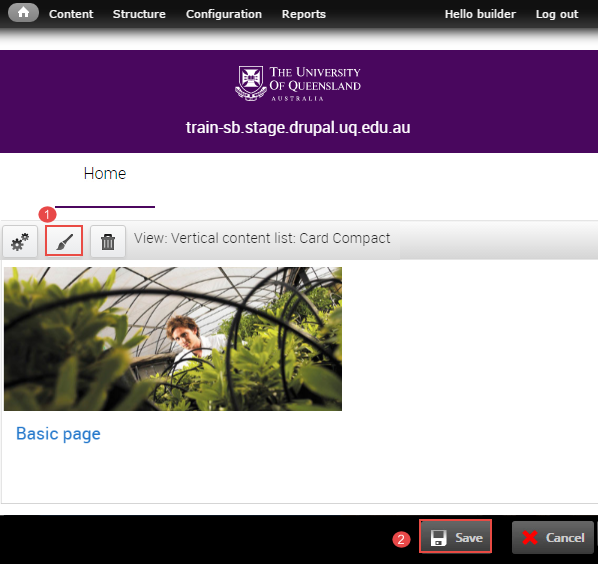
Step 5
The system returns to the panel page In-Place Editor.
-
Add Pane Styling to edit the display of the component on the panel page. Refer to the instructions, Add Pane Style.
-
Click Save to complete the process of adding the component.
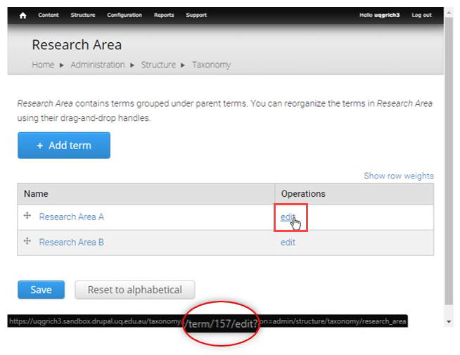
Find the taxonomy term ID
Each taxonomy term has an ID number. Some Views such as the Vertical Content List can be filtered by terms, and to configure this you need to know the ID of the term.
Step 1
Navigate to the vocabulary list of terms
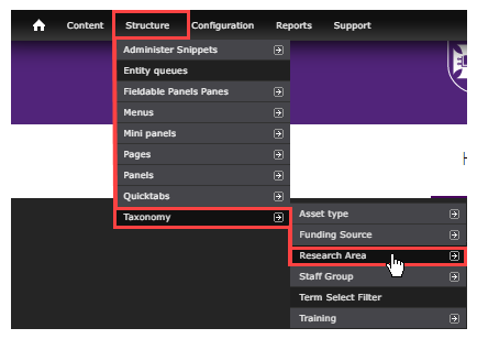
Step 2
- hover over the edit hyperlink
- review the URL path which includes the taxonomy term ID of the term component, which in this example is 307.
Add section pane style
Step 1
Click Customize this page to start editing the page.
Step 2
Click the paint brush button on the component to open the pane style form.
Step 3
The "Pane style" form displays.
- Selection Section
- Click Next
Step 4
It is optional to enter content in the Style settings fields. The contents in the fields will display in the pane as shown in the image below.
- Section Title
- Title element - Select the heading style from the range h2 to h4. The default is h2.
- Summary content
- Footer content
- Background image (Optional)
Images should support the content. Avoid busy images that make the component content difficult to read. Aim to use textures or photos with a single point of focus.- Click Choose file and select an image from your computer.
- Click Upload
- Top spacing
- Bottom spacing
- Theme - If a background image was used, a dark or light tint can be applied to improve contrast for the Section and component pane content.
- Text colour - The text colour selection only applies to the Section Title, Summary Content and Footer Content fields. Select either light or dark text.
Components generally provide their own theme options to manage text colour.
Note: To change the colour of the content inside the section to light you will have to apply the css class light-palette to the component through the edit panel interface.
-
Layout
There are three (3) options for layout.Single column, centred
Single column, left-aligned
Two column, left-aligned
-
Utility
-
Allow overflow - Used when a Section pane style wraps a component containing a drop down list that extends below the height of the Section, so that the drop down is not cut off. This has some design implications for tints used on the Sections so double check the display if using this option.
-
-
Click Save to accept the pane style settings.
Step 5
The system returns to the panel page In-Place Editor. Click Save to complete process of styling the component.
The completed component displays.
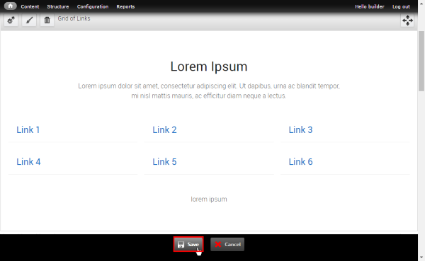
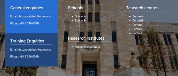
Exercise 6 Guides - Create a grid of links
Create a grid of links
Use this component to group informative / dense content under one title and summary.
Display features
- 1-2 line title, 10 words maximum
- 25 - 30 word summary
- short link text, 1 to 3 words
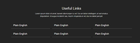
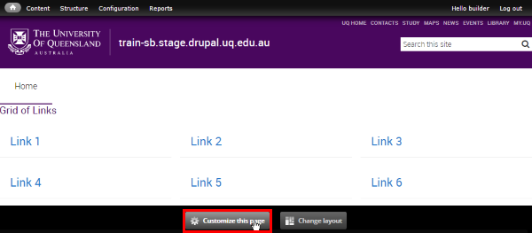
The grid of links component is inserted by the site builder.
Step 1
Click Customize this page to add the grid of links component to a panel page.
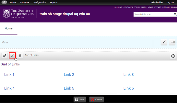
Step 2
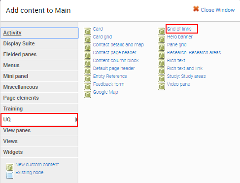
The available regions where components can be added are displayed as blue shaded fields. Click the plus (+) button to open the list of available components grouped by category.
Step 3
The available components display. Click on the UQ category and then select the Grid of Links component to open the configuration form.
Step 4
The configuration form for the Grid of Links displays.
- Title - insert a title for the component. This assists in identifying the component on the Panel Content page.
- View mode - For the grid of links select 2, 3 or 4 column.
- Links - insert the title (128 character limit) and URL
Relative reference - use for links to internal website content (e.g. learn/uq-standard)
Absolute reference - use for links to external website content (e.g. www.google.com)
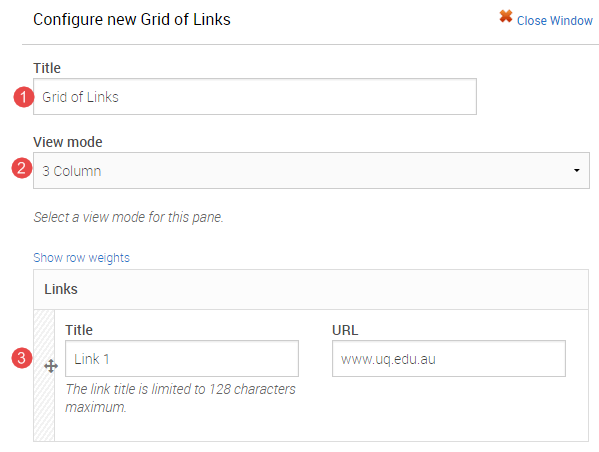
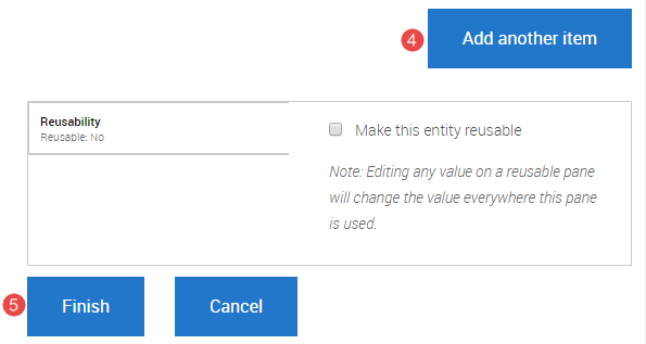
- Click Add another item to add additional links.
Tip: ensure the links are evenly spread across the columns where possible. - Click Finish after all the links have been added.
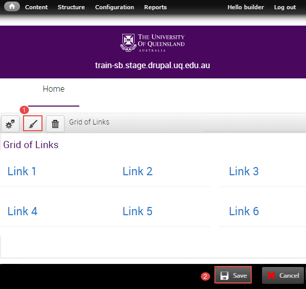
Step 5
The system returns to the panel page In-Place Editor.
-
Add Pane Styling to edit the display of the component on the panel page. Refer to the instructions, Add Pane Style.
-
Click Save to complete the process of adding the component.
Add section pane style
Step 1
Click Customize this page to start editing the page.
Step 2
Click the paint brush button on the component to open the pane style form.
Step 3
The "Pane style" form displays.
- Selection Section
- Click Next
Step 4
It is optional to enter content in the Style settings fields. The contents in the fields will display in the pane as shown in the image below.
- Section Title
- Title element - Select the heading style from the range h2 to h4. The default is h2.
- Summary content
- Footer content
- Background image (Optional)
Images should support the content. Avoid busy images that make the component content difficult to read. Aim to use textures or photos with a single point of focus.- Click Choose file and select an image from your computer.
- Click Upload
- Top spacing
- Bottom spacing
- Theme - If a background image was used, a dark or light tint can be applied to improve contrast for the Section and component pane content.
- Text colour - The text colour selection only applies to the Section Title, Summary Content and Footer Content fields. Select either light or dark text.
Components generally provide their own theme options to manage text colour.
Note: To change the colour of the content inside the section to light you will have to apply the css class light-palette to the component through the edit panel interface.
-
Layout
There are three (3) options for layout.Single column, centred
Single column, left-aligned
Two column, left-aligned
-
Utility
-
Allow overflow - Used when a Section pane style wraps a component containing a drop down list that extends below the height of the Section, so that the drop down is not cut off. This has some design implications for tints used on the Sections so double check the display if using this option.
-
-
Click Save to accept the pane style settings.
Step 5
The system returns to the panel page In-Place Editor. Click Save to complete process of styling the component.
The completed component displays.
Exercise 7 guides - Insert a content column block
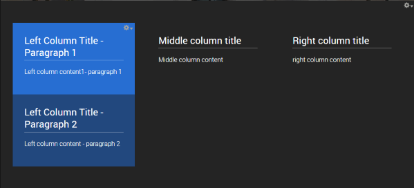
Insert a content column block
Use this component when it’s necessary to provide contextual information and imagery leading into a news story, event, or informational content. Images should have a similar tone and treatment to visually unify the panel.
Display Features
- 3 column layout display - left, middle and right
- optional background image
Step 1
Click Customize this page to add the content column block component to a panel page.
Step 2
The available regions where components can be added are displayed as blue shaded fields. Click the plus (+) button to open the list of available components grouped by category.
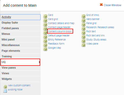
Step 3
The available components display. Click on the UQ category and then select the Content column block component to open the configuration form.
Step 4
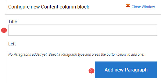
The configuration form for the Content column block displays.
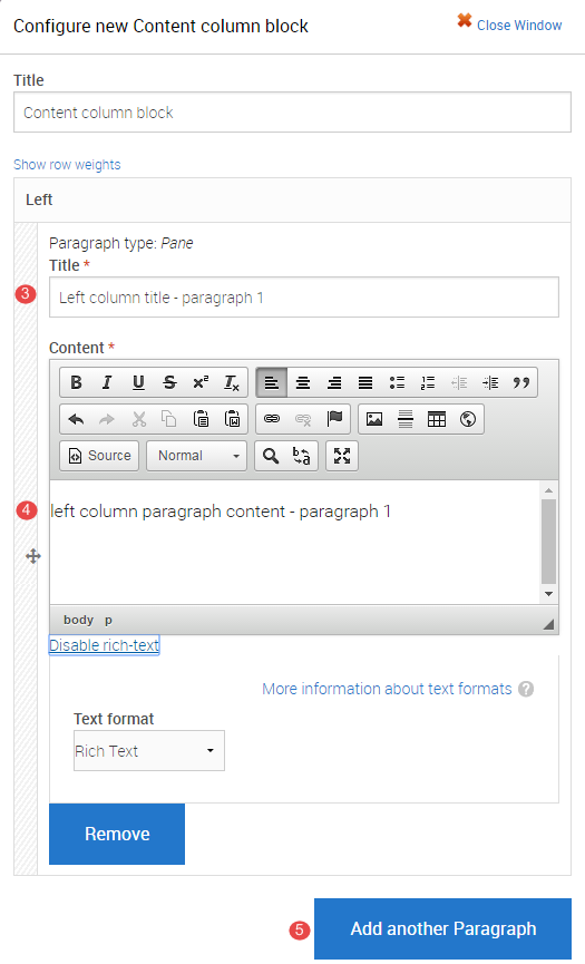
- Title - insert a title for the component. This assists in identifying the component on the Panel Content page.
- Click Add new paragraph to display the fields to complete.
- Title - enter the paragraph title
- Content - enter the content to display in the paragraph
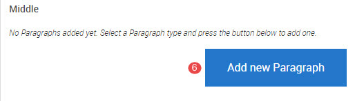
- Click Add new paragraph to add an additional paragraph in the column .
Complete numbers 3 to 5 for the new paragraph then proceed to number 6 to add a new paragraph to the middle column.
- In the middle column, click Add new Paragraph to add links. Complete numbers 3 to 5 for the new paragraph then proceed to number 7 to add a new paragraph to the right column.
- In the right column, click Add new Paragraph. Complete numbers 3 to 5 for the new paragraph.
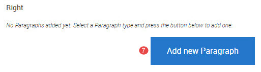
Tip: ensure the links are evenly spread across the columns where possible.
- Click Finish after all the links have been added.
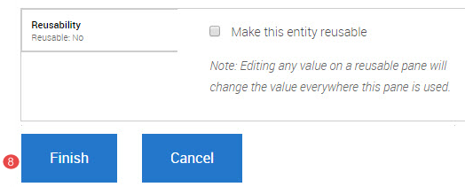
Step 5
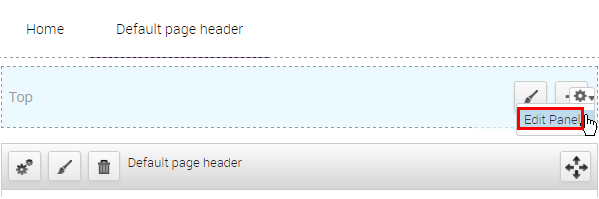
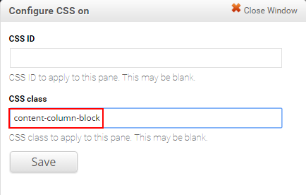
To add the required CSS, hover the mouse over the plus (+) button and the cog will appear. Click the cog and then click Edit Panel.
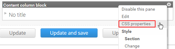
Step 6
Click the right-hand edit cog on the Content column block component. Click CSS properties.
Step 7
Enter content-column-block in the CSS class field and click Save.
Step 8
Click Update and Save
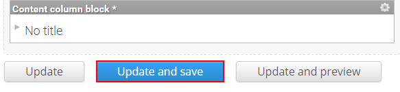
The system returns to the saved panel page.
Step 9
Add Pane Styling to edit the display of the component on the panel page. Refer to the instructions, Add Pane Style.
Add section pane style
Step 1
Click Customize this page to start editing the page.
Step 2
Click the paint brush button on the component to open the pane style form.
Step 3
The "Pane style" form displays.
- Selection Section
- Click Next
Step 4
It is optional to enter content in the Style settings fields. The contents in the fields will display in the pane as shown in the image below.
- Section Title
- Title element - Select the heading style from the range h2 to h4. The default is h2.
- Summary content
- Footer content
- Background image (Optional)
Images should support the content. Avoid busy images that make the component content difficult to read. Aim to use textures or photos with a single point of focus.- Click Choose file and select an image from your computer.
- Click Upload
- Top spacing
- Bottom spacing
- Theme - If a background image was used, a dark or light tint can be applied to improve contrast for the Section and component pane content.
- Text colour - The text colour selection only applies to the Section Title, Summary Content and Footer Content fields. Select either light or dark text.
Components generally provide their own theme options to manage text colour.
Note: To change the colour of the content inside the section to light you will have to apply the css class light-palette to the component through the edit panel interface.
-
Layout
There are three (3) options for layout.Single column, centred
Single column, left-aligned
Two column, left-aligned
-
Utility
-
Allow overflow - Used when a Section pane style wraps a component containing a drop down list that extends below the height of the Section, so that the drop down is not cut off. This has some design implications for tints used on the Sections so double check the display if using this option.
-
-
Click Save to accept the pane style settings.
Step 5
The system returns to the panel page In-Place Editor. Click Save to complete process of styling the component.
The completed component displays.
Exercise 8 guides - Create a mini panel
Create a mini panel
Mini panels are nested panels layouts inside a Panels page. They allow another grid layout to be used within the layout of the the parent page. For instance a 2 column mini panel can be placed in a single column page layout.
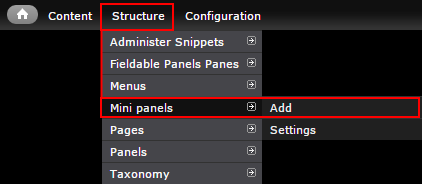
Step 1
In the administration menu, go to Structure > Mini panels > Add.
Step 2
Complete the numbered items and click continue to move to Context.
- Administrative title - Identifying label for the mini panel.
Tip: Use a naming convention to easily tell them apart. e.g. MP: Home: Social media - Administrative description - Optional. If the title is not obvious, provide further detail of the purpose of this mini panel.
- Category - The group your custom components and mini panels will list
Tip: Use your Org Unit abbreviation (e.g. ITS) to group all your reusable components and mini panels.
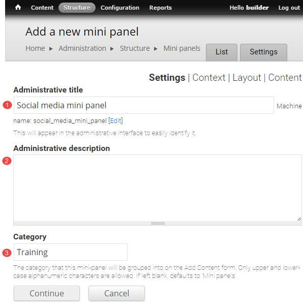
Click Continue to move to context.
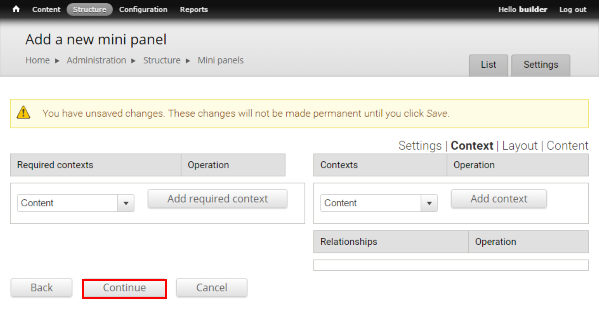
Step 3
99% of the time contexts are not required. Click Continue to move to layout
Step 4
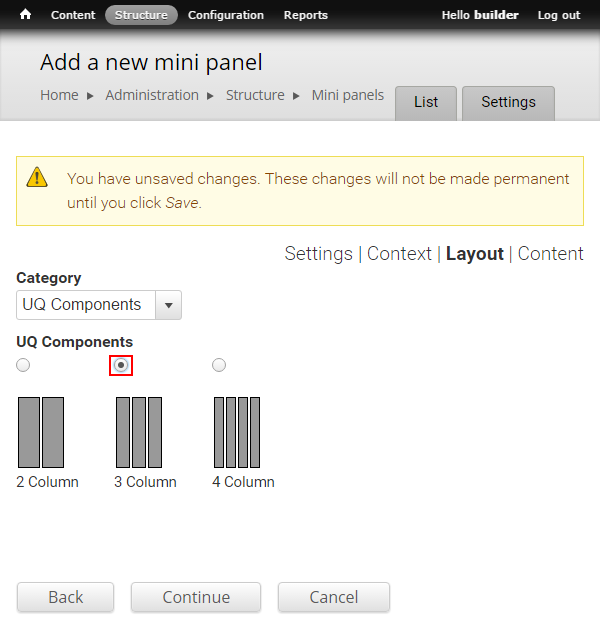
Select a UQ layout type from Category drop-down. Mini panels most commonly use UQ Components.
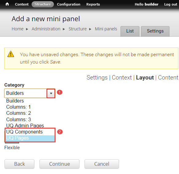
Step 5
Choose the desired layout and click Continue to move to Content
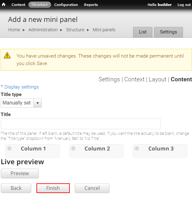
Step 6
It is recommended to click Finish to save the mini panel before adding content to the regions to ensure you don't lose any progress.
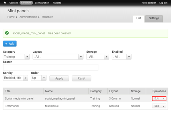
Add components to a mini panel
Step 1
Click the edit drop-down to edit the mini panel.
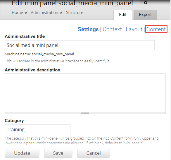
Step 2
The Settings screen opens. Click Content to add or edit components.
Step 3
- Click the edit cog within each layout region to add components to that region.
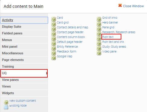
- Select Add content to open the list of available components grouped by category.
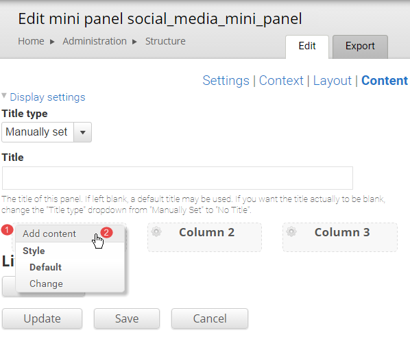
Step 4
Choose a category (most UQ components are grouped under UQ or View panes) and then select the component to add.
Step 5
Complete the applicable configuration for each component and then click Finish to save the configured component.
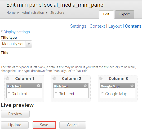
Step 6
Add components to the remaining columns and click Save to save the mini panel.
Insert a mini panel in a panel page
A mini panel is inserted in a panel page in the same way as other components.
Step 1
Click Customize this page to start adding components to a panel page.
Step 2
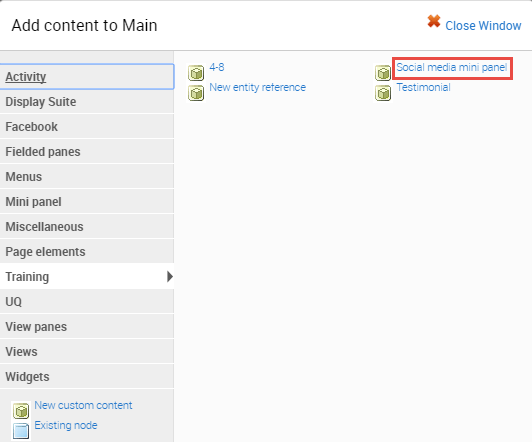
The available regions where components can be added are displayed as blue shaded fields. Click the plus (+) button to open the list of available components grouped by category.
Step 3
The available components display. Click on the category where the mini panel has been saved and select the mini panel.
Step 4
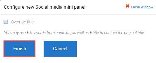
The configuration form for the mini panel displays. Click Finish.
Step 5
Return to the Panel page.
Depending on the page layout used, it might be necessary to add a Section pane style to the mini panel.
Edit a mini panel
There are two (2) ways to access the mini panel to edit it.
- via the administration menu
- via the Panel edit screen
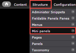
Via Structure menu
Step 1
In the administration menu, go to Structure > Mini panels
Step 2
Click the edit drop-down to add or edit the components for the mini panel.
Step 3
The configuration page for the mini panel opens on Settings. Click Content to add or edit components.
Via Panel edit screen
While editing the Panel page:
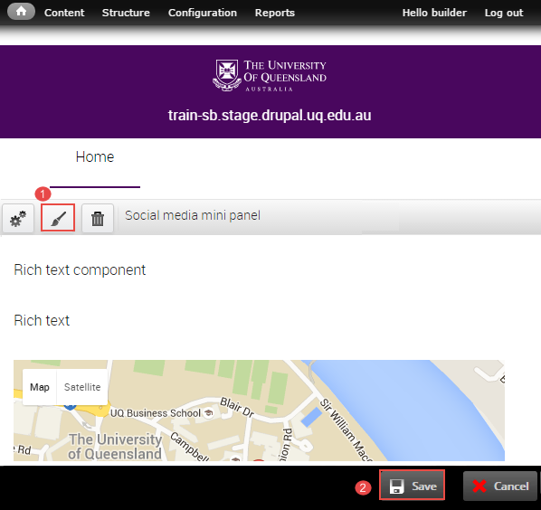
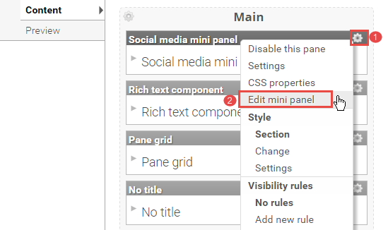
- Click on the edit cog to display the menu
- Select Edit mini panel to display the mini panel content. The back-end of the mini panel opens in a new browser tab.
Step 3
The backend of the mini panel displays. Edit as per Adding components to the mini panel
Add section pane style
Step 1
Click Customize this page to start editing the page.
Step 2
Click the paint brush button on the component to open the pane style form.
Step 3
The "Pane style" form displays.
- Selection Section
- Click Next
Step 4
It is optional to enter content in the Style settings fields. The contents in the fields will display in the pane as shown in the image below.
- Section Title
- Title element - Select the heading style from the range h2 to h4. The default is h2.
- Summary content
- Footer content
- Background image (Optional)
Images should support the content. Avoid busy images that make the component content difficult to read. Aim to use textures or photos with a single point of focus.- Click Choose file and select an image from your computer.
- Click Upload
- Top spacing
- Bottom spacing
- Theme - If a background image was used, a dark or light tint can be applied to improve contrast for the Section and component pane content.
- Text colour - The text colour selection only applies to the Section Title, Summary Content and Footer Content fields. Select either light or dark text.
Components generally provide their own theme options to manage text colour.
Note: To change the colour of the content inside the section to light you will have to apply the css class light-palette to the component through the edit panel interface.
-
Layout
There are three (3) options for layout.Single column, centred
Single column, left-aligned
Two column, left-aligned
-
Utility
-
Allow overflow - Used when a Section pane style wraps a component containing a drop down list that extends below the height of the Section, so that the drop down is not cut off. This has some design implications for tints used on the Sections so double check the display if using this option.
-
-
Click Save to accept the pane style settings.
Step 5
The system returns to the panel page In-Place Editor. Click Save to complete process of styling the component.
The completed component displays.
How do I find my mini panel?
To access the list of panel pages on your website follow these steps:
- Go to Structure > Panels to display the list of mini panels.
- Scroll to your mini panel
- Click edit to open the mini panel.
Only edit mini panels created by site builders in your organisational unit.
Completing training and requesting access
Once you complete all tasks, you need to request access to the sites you want to be a site builder on.