Drupal 7 components
Understanding components
Drupal 7 has several page types including basic pages, structured pages and panel pages. Panel pages are made up of components, which provide specific layout and functionality for displaying content on a panel page.
Depending on your level of access, you can edit some components on a panel page.
Learn more about:
Learning outcomes
At the end of the topic, you will be able to:
- update the image and text of the hero component
- update the body field of the rich text component
- distinguish between the section pane fields (section title, section summary content, section footer content, background image) and the body field of the rich text component
- update the title, image, content, primary link and action link (title and URL) fields for the custom card paragraphs in the card grid component
- explain when to use a relative path link and the absolute path link
- identify the key factors to consider when selecting an image.
Tasks to complete
For this topic, you are required to complete 3 tasks:
1. Edit a hero banner component
Essential guides
Check these guides before you complete the task.
- Drupal 7 hero banners – understand what a hero banner is and when to use it.
- Best practice for hero banners
- Hero banner fields – mandatory and optional fields and what will display on a hero banner.
- Images for the web – learn about sourcing and crediting images, cropping to the correct dimensions and optimising for best web display.
Edit a Hero banner
Step 1
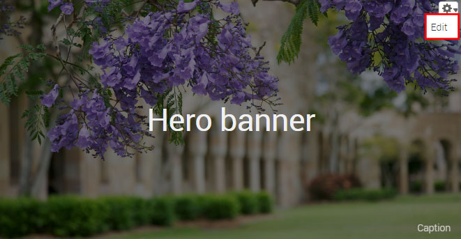
Hover the mouse pointer over the right-hand corner of the hero banner pane to display the Edit cog ( ). Click the icon to display the menu and click Edit to open.
Step 2
The configuration form for the hero banner component displays.
- Title – the page title.
- Image – the minimum image dimensions should be 2560px X 560px.
- Caption – for the purposes of attributing the image as per the copyright of the image.
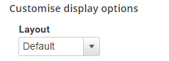
- Layout – select between the default and thin banner
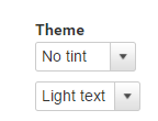
- Theme – choose between none, dark or light tint to overlay the image.
- Text – depending on the selected tint, choose the text light or dark to ensure sufficient contrast between the text and image to improve legibility.
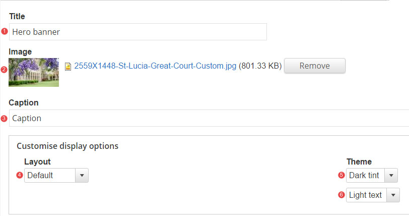
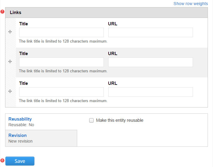
- Links – insert relative path links when linking to content on the site. If required, select between 1, 2 or 3 links.
- Save the changes.
Task instructions
To complete the task:
- Navigate to the shared Drupal 7 training sandbox.
- Hover over 'Fundamentals component example pages' in the top menu.
- Select a 'Fundamentals training: example page'. If it looks like someone has already edited the page you select, choose another one.
- Follow the numbered actions below to edit the hero banner component.
1. Title field
Replace the current title with your chosen title. Include your initials at the end of the page title so you can identify which page is yours.
2. Image field
Click 'Browse', then upload an image from the downloaded training files with a width of at least 2560px.
When selecting an image ensure that you have considered image size guidelines.
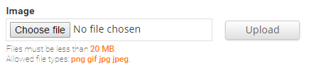
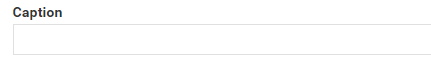
3. Caption field
Insert the text: Photo by Name Surname
4. Layout field
Select the option: Thin banner
5. Theme field
Select the theme that provides the best contrast for your selected image.
6. Save the changes to the hero component.
Review your hero banner
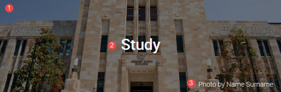
Compare your edited hero banner component with the following exemplar.
The numbered information that follows applies to the image below.
- Background image – The background image can be changed by adding a tint (dark or light). Ensure that there is sufficient contrast between the text and the image. You can use the Wave web accessibility tool to check the contrast.
- Title – this is the H1 of your page
- Caption – attribute images where applicable to ensure compliance with the conditions of use associated with the image.
Avoid using Microsoft Edge for Drupal training.