Drupal 7 components
Understanding components
Drupal 7 has several page types including basic pages, structured pages and panel pages. Panel pages are made up of components, which provide specific layout and functionality for displaying content on a panel page.
Depending on your level of access, you can edit some components on a panel page.
Learn more about:
Learning outcomes
At the end of the topic, you will be able to:
- update the image and text of the hero component
- update the body field of the rich text component
- distinguish between the section pane fields (section title, section summary content, section footer content, background image) and the body field of the rich text component
- update the title, image, content, primary link and action link (title and URL) fields for the custom card paragraphs in the card grid component
- explain when to use a relative path link and the absolute path link
- identify the key factors to consider when selecting an image.
Tasks to complete
For this topic, you are required to complete 3 tasks:
3. Edit a card grid component
Essential guides
Check these guides prior to completing the task.
- Understanding card grids – learn what a card grid is and when to use it.
- Card grid fields – what fields you need to complete to display a card.
- Image dimensions and cropping – to ensure you crop images to the correct size for cards.
- Links – write good link text and understand the difference between relative and absolute links.
Card grid
Use this component when it’s necessary to highlight content that requires the user to navigate to a sub-page for further detail. Images should have a similar tone and treatment to visually unify the panel.
Cards can be added as either custom cards where all fields are manually set, or as node references where the content of the card comes from the node page being referenced.
Step 1
Using the mouse, hover the pointer over the right-hand corner of the card grid component to activate the field and display the Edit cog ( ). Click the icon to display the menu.
Step 2
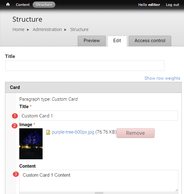
The menu displays. Select Edit to open the configuration form for the card grid, scroll to the card to be edited and edit the required fields.
- Title - Limit the title length, so that it does not exceed 3 lines on the card.
- Image - recommended image dimensions is 640px x 640px. Ensure the image is relevant to the topic of the card.
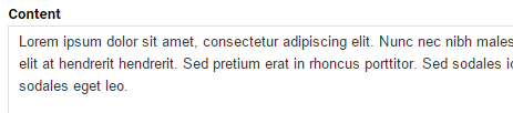
- Content - (optional) brief summary of up to 20 words.
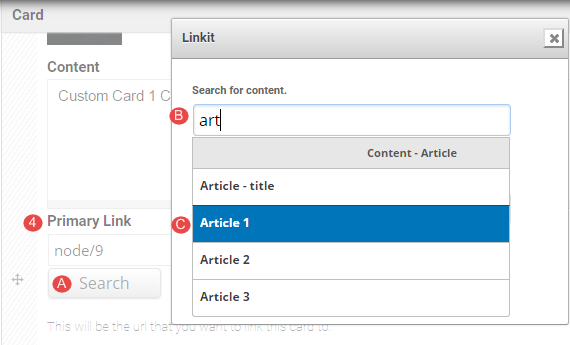
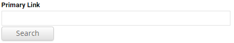
- Primary link - used to create the hyperlinked card title. If linking to content on the same website, follow steps 4A-4D to insert a relative link.
A. Click Search
B. Type in minimum of 3 letters of a word in the Search for content field.
C. Select the Content from the list of suggested content.
D. Click Insert link.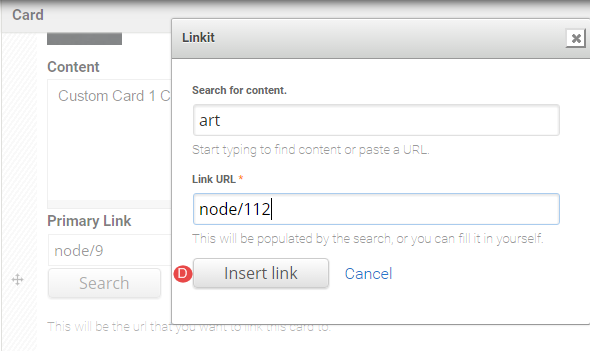
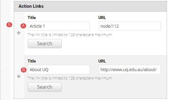
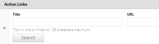
- Action Links – secondary links on the card. Can be used for further information or calls to action. If linking to content on the same website, follow the steps 4 A-D above to insert a relative link.
Note
If the relative link is used, the title field will display the title of the content that it is linked to.
If an absolute link is used for content that does not exist on your site, type in an appropriate title and enter the absolute URL in the URL field.
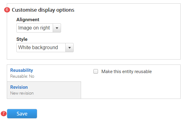
Customise display options is restricted to site builders.
Click Save to save the configured card grid (column card) and return to the panel page.
Task instructions
Use the same page you used in the hero banner task to edit the card grid component.
Edit Example card 1 of the card grid component titled Card grid component.
Follow the numbered actions below before saving the changes.
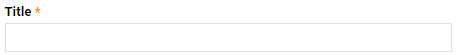
1. Title field
Replace the current title with your chosen title.
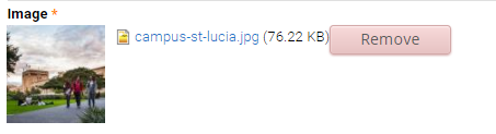
2. Image field
Remove the existing image.
Upload an image. Select an image from the downloaded training files with a width of at least 640px.
How does image size, image relevance, text in images and copyright impact your website?
3. Content field
Insert the following shaded text: Content - this text should be brief but give the user enough information scent to click the title link to access in-depth information.
4. Primary link
Insert a link in the primary link field.
Always use a relative path link when linking to content on the local website (your website).
5. Action links
The action links are calls to action. They may link to pages such as more information or register.
Link field - Insert a link in the Title and URL fields.
6. Save the changes to the card grid component.
Review your card grid component
Compare your edited rich text component with the following exemplar.
Remember:
- site editors can update all the card fields in the card grid.
- site editors cannot add more cards or delete existing cards.
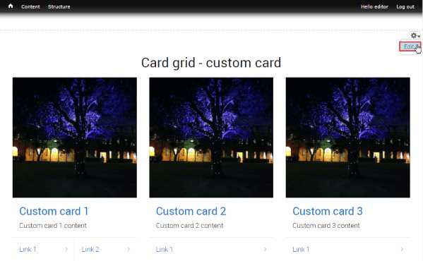
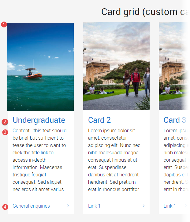
The following information applies to the image below.
- Image
Remember to consider image size and relevance, as well as any potential copyright restrictions. Avoid text in images (because it is not accessibile). - Title and primary link
When a primary link is inserted for a card, it hyperlinks to the title and image of that card. - Content
The amount of text in the content field determines the height of the card grid. Ideally, the amount of text should be equivalent across all the cards in a card grid to ensure a balanced "look" for the card grid component. - Action link
The link in the action link section of the card is optional. It is intended for calls to action.
Fundamentals training: next topic
Basic pagesAvoid using Microsoft Edge for Drupal training.